40 Signature Fonts for Certificates

Not every font that looks "fancy" belongs on a signature line. Some are genuinely handwriting fonts, built to sit under a name like a real signature. Others are formal fonts or blackletter styles that look great as a heading, a title, or a seal - but would look strange if you tried to sign something with them.
This list covers 40 fonts across both categories, grouped honestly so you know which font that looks like an actual signature to reach for, and which font signature pairing to avoid. If you're still deciding on fonts for the rest of the certificate, our guide to the 30 best fonts for certificates covers the body-copy and title side of that decision in more depth.
Quick Guide: How to Choose the Right Signature Font
| You need... | Reach for |
|---|---|
| A genuinely handwriting-looking signature | Anything in Section 1 |
| A heading, title, or certifying body name | Section 2 |
| A stamped, historic, or "official seal" feel | Section 3 |
| Names in different lengths on one template | Test at your actual name length, not the preview |
Choosing the right font isn't just about taste - it's about matching the font to the job. A signature font has to look like real handwriting under pressure, at small sizes, in a name the designer never previewed. A title font just has to look credible. Keep those two jobs separate and choosing the best option for each gets a lot easier.
Section 1: Handwriting Fonts That Look Like a Real Signature
These are the ones that actually read as handwriting. Use these on the signature line itself - this is where a font that looks like a genuine, personal signature earns its place.
1. Alex Brush - brush-script, holds up well at small sizes.
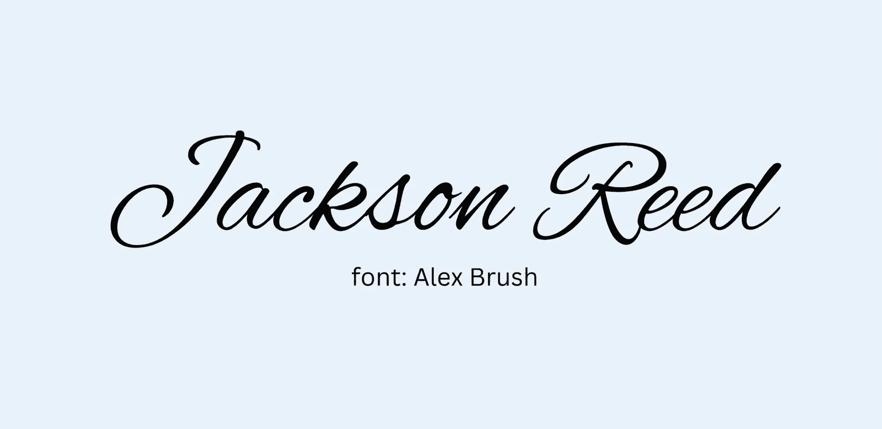
Best for: diplomas, professional certifications. Alex Brush is one of the most reliable handwriting fonts for certificates because the strokes stay legible even when the signature field is narrow. It reads as a confident, adult signature rather than a decorative flourish, which is exactly the tone most professional credentials are going for.
2. Great Vibes - long entry strokes, luxury feel.
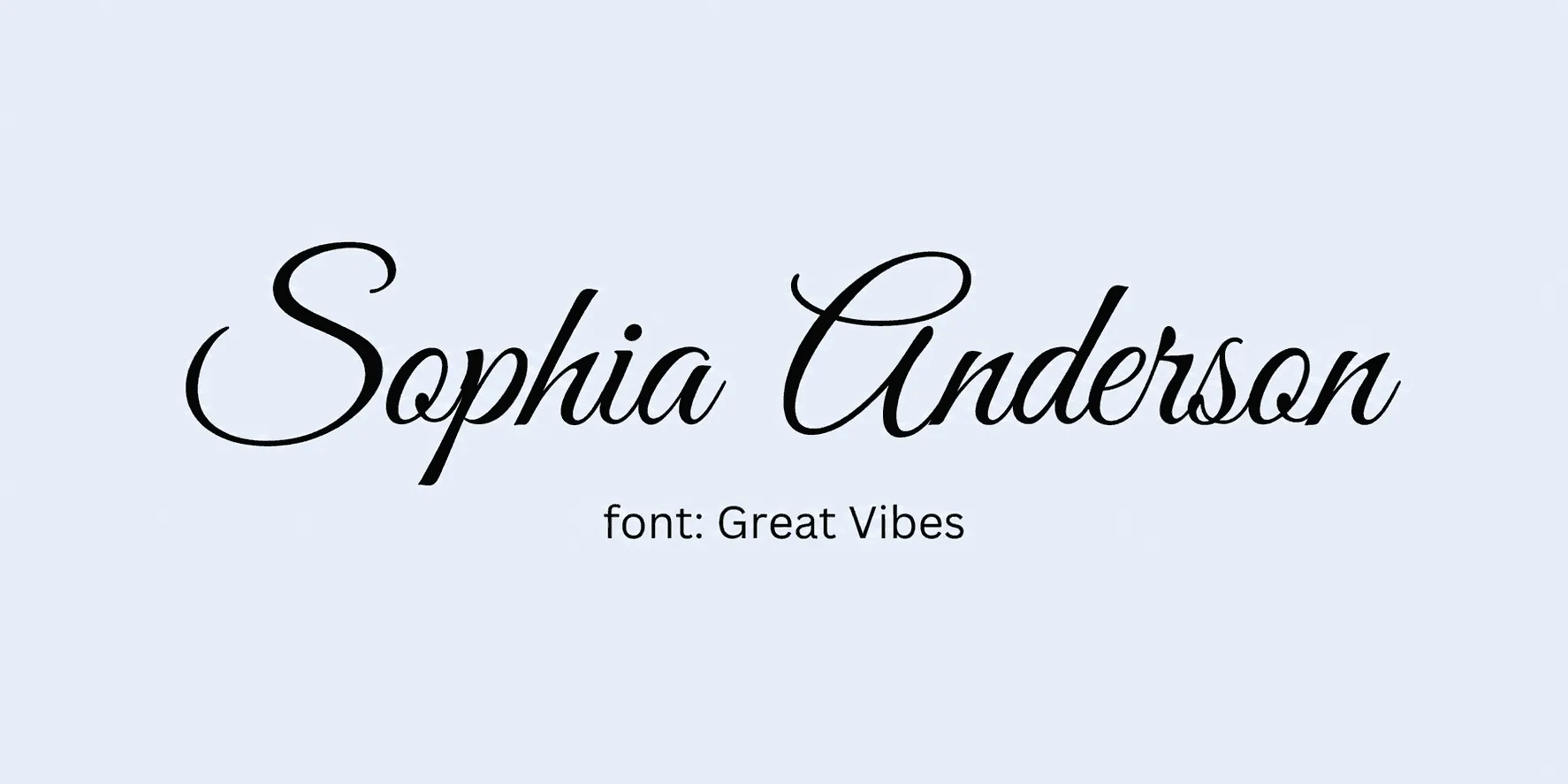
Best for: award ceremonies, executive recognitions. Great Vibes leans into drama with its sweeping entry strokes, so it works best when the certificate already has some visual weight to match - gold foil, a seal, a heavier border. On a plain template, Great Vibes can look slightly out of place next to simpler design elements.
3. Dancing Script - playful, bouncy lowercase.
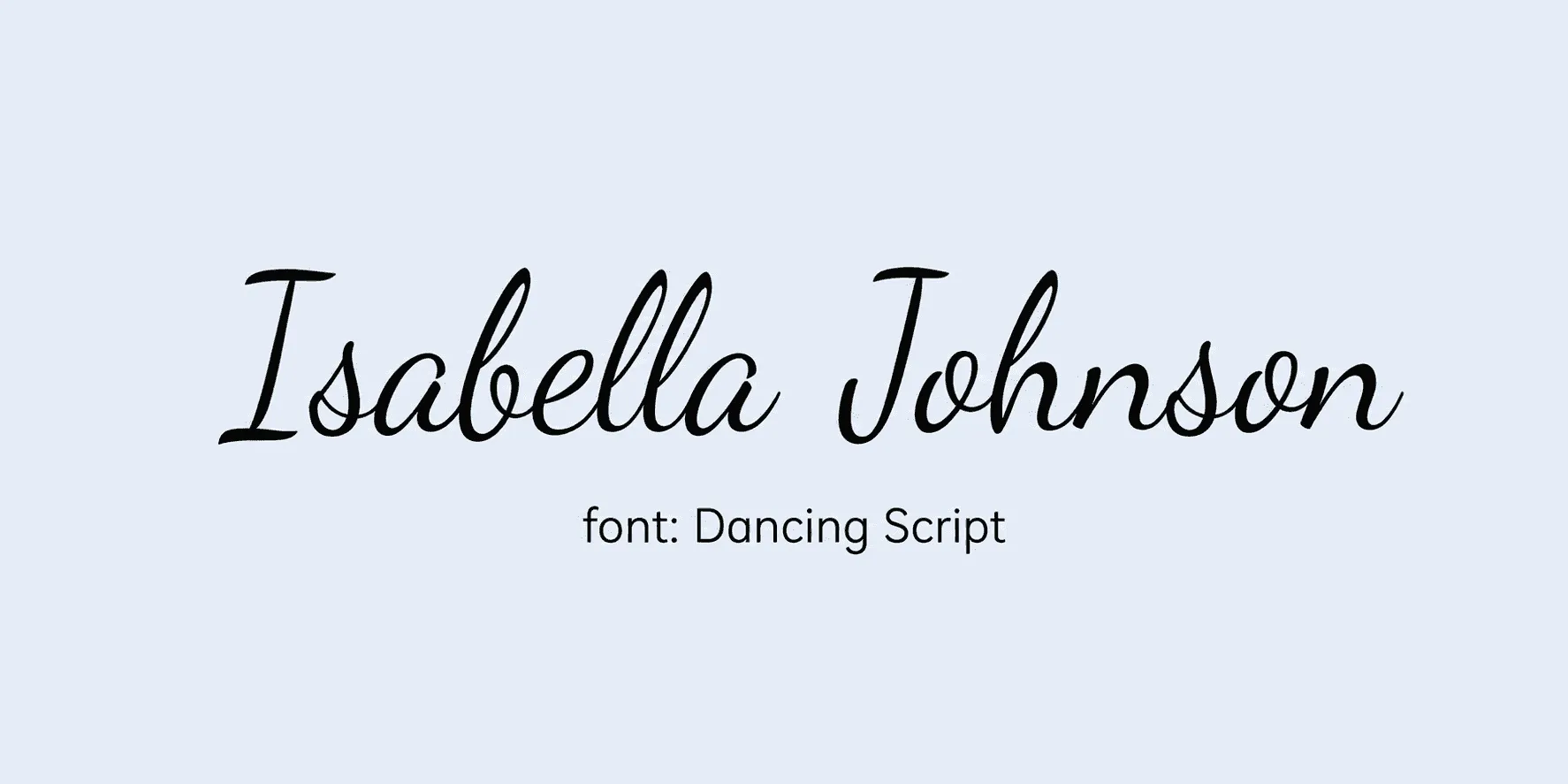
Best for: course completions, webinars. The bounce in Dancing Script makes it feel approachable rather than authoritative, which suits shorter, friendlier programs. It's also one of the more forgiving handwriting fonts for names with unusual letter combinations, since the lowercase shapes stay open and easy to read.
4. Kalam - more legible than most scripts, less ornamental.
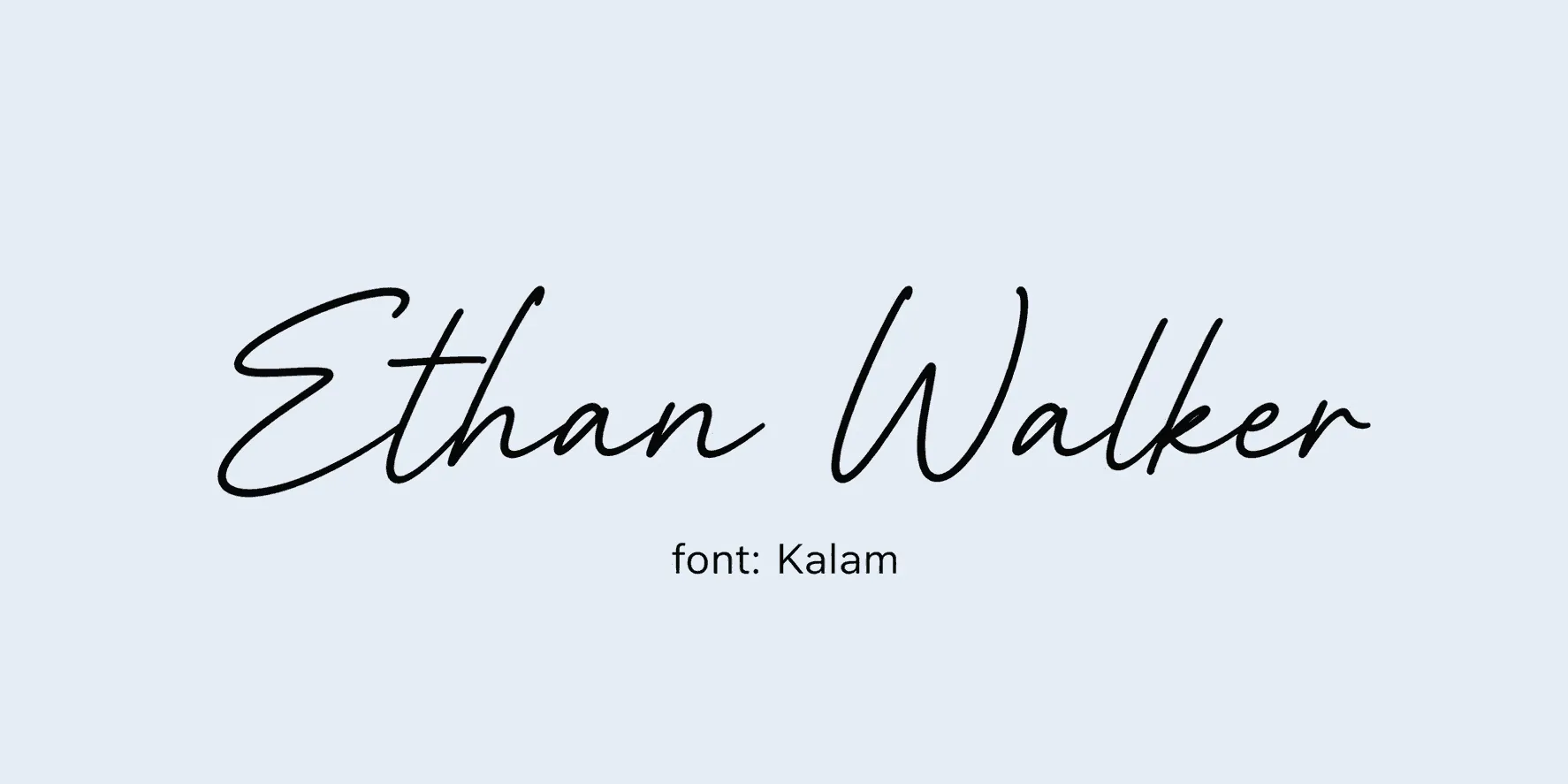
Best for: busy layouts with photos or seals. Kalam trades some elegance for readability, which is exactly what you want when a signature has to sit near a photo, aQR code for certificate verification, or a seal. It's also one of the stronger choices if you're issuing certificates internationally, since its character support handles accented names better than most decorative scripts.
5. Satisfy - relaxed, modern, no exaggerated swoops.
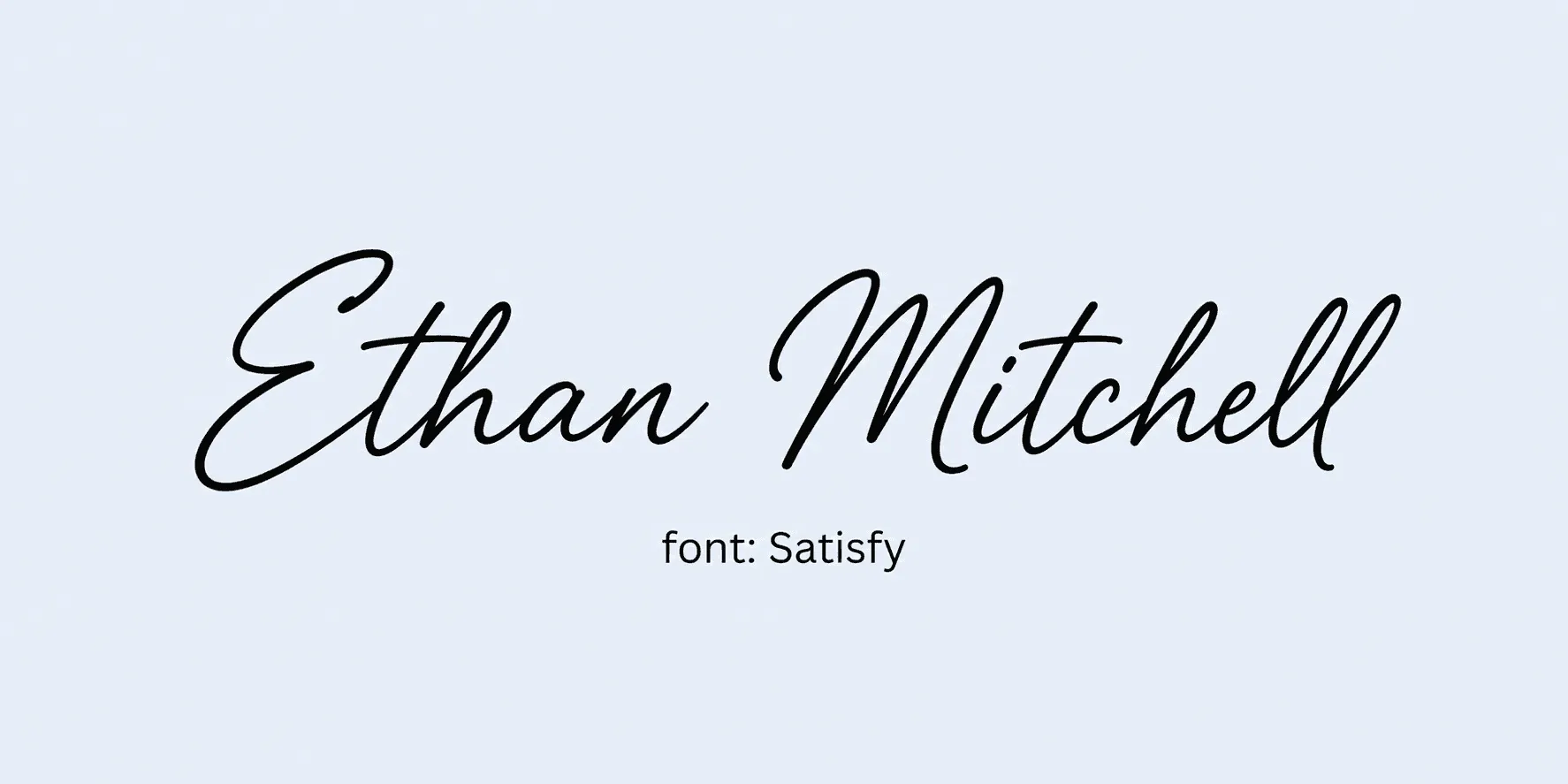
Best for: minimalist templates. Because Satisfy skips the exaggerated swoops, it pairs cleanly with simple sans-serif body text without competing for attention. It's a good default when you want the signature to look personal but not the loudest thing on the page.
6. Marck Script - structured loops, business-appropriate.
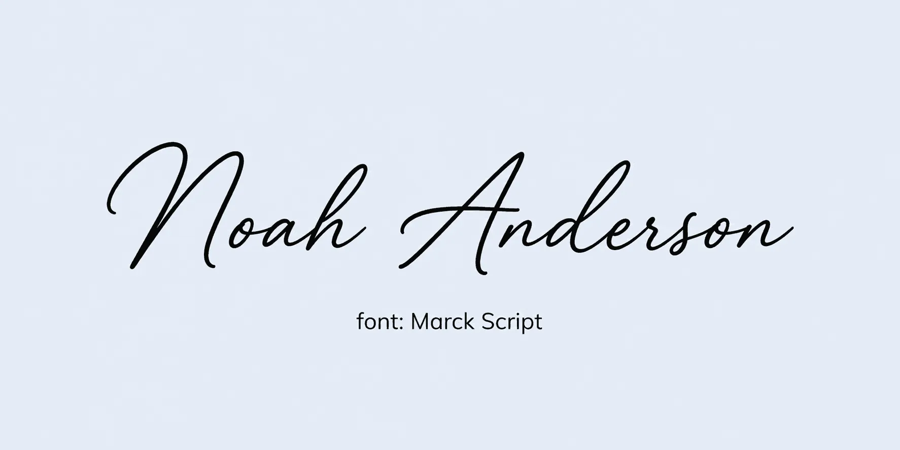
Best for: corporate training certificates. Marck Script keeps its loops tight and consistent, so it reads as tidy rather than casual - a good fit for internal training or compliance certificates where the tone needs to stay professional. It also holds its shape reasonably well when scaled down for digital badges.
7. Monte Carlo - bold, high-contrast, commanding.
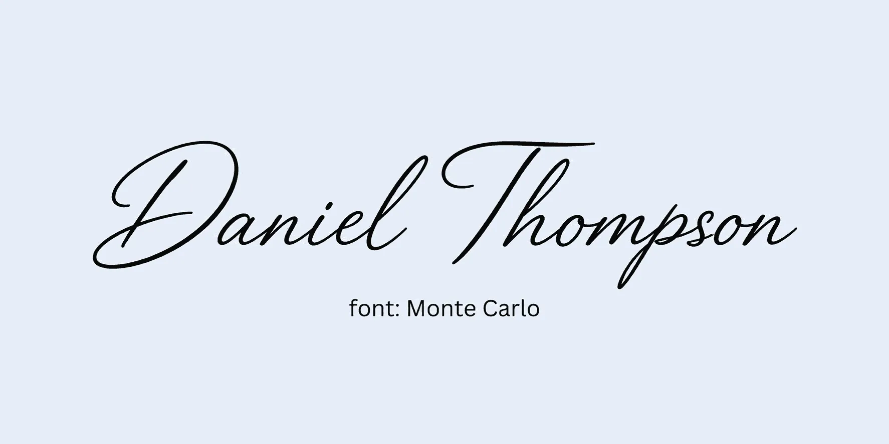
Best for: executive and membership credentials. The high stroke contrast in Monte Carlo gives it real presence, so it suits certificates where the signer's name is meant to carry some authority - executive appointments, board recognitions, membership tiers. Use it sparingly elsewhere on the page so the signature stays the visual anchor.
8. Whisper - delicate, quiet curves.
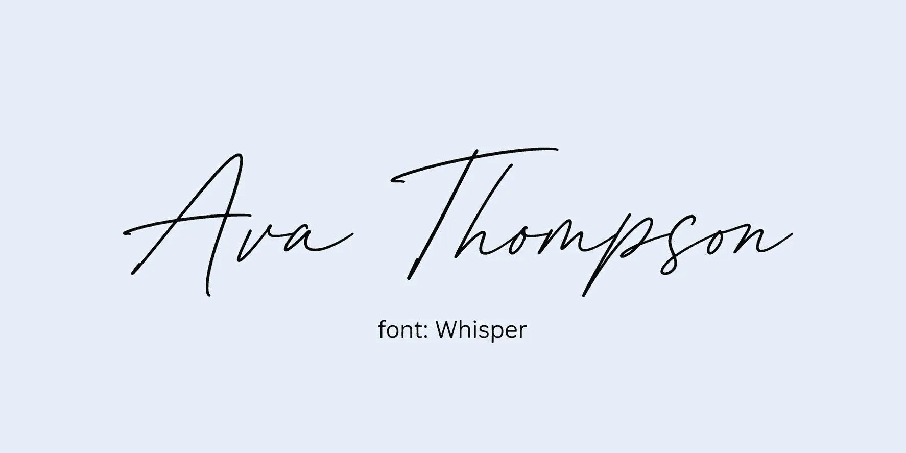
Best for: anywhere the signature shouldn't outshine the design. Whisper is intentionally understated, which makes it a smart pick when the certificate's main visual interest is somewhere else - a photo, a crest, a heavily designed border. Just be aware its thin strokes need decent print or screen resolution to stay crisp.
9. Birthstone - cursive with a modern edge.
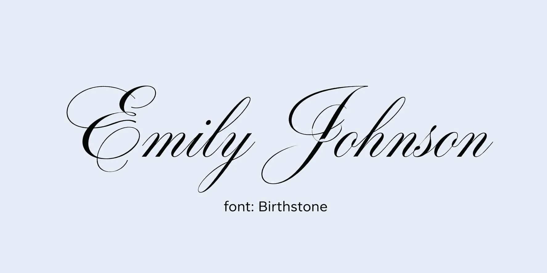
Best for: creative program certificates. Birthstone keeps a cursive base but sharpens the edges just enough to feel current rather than old-fashioned. It suits creative bootcamps, design programs, or anything where a purely traditional script would feel mismatched with the subject matter.
10. Ephesis - bold and expressive.
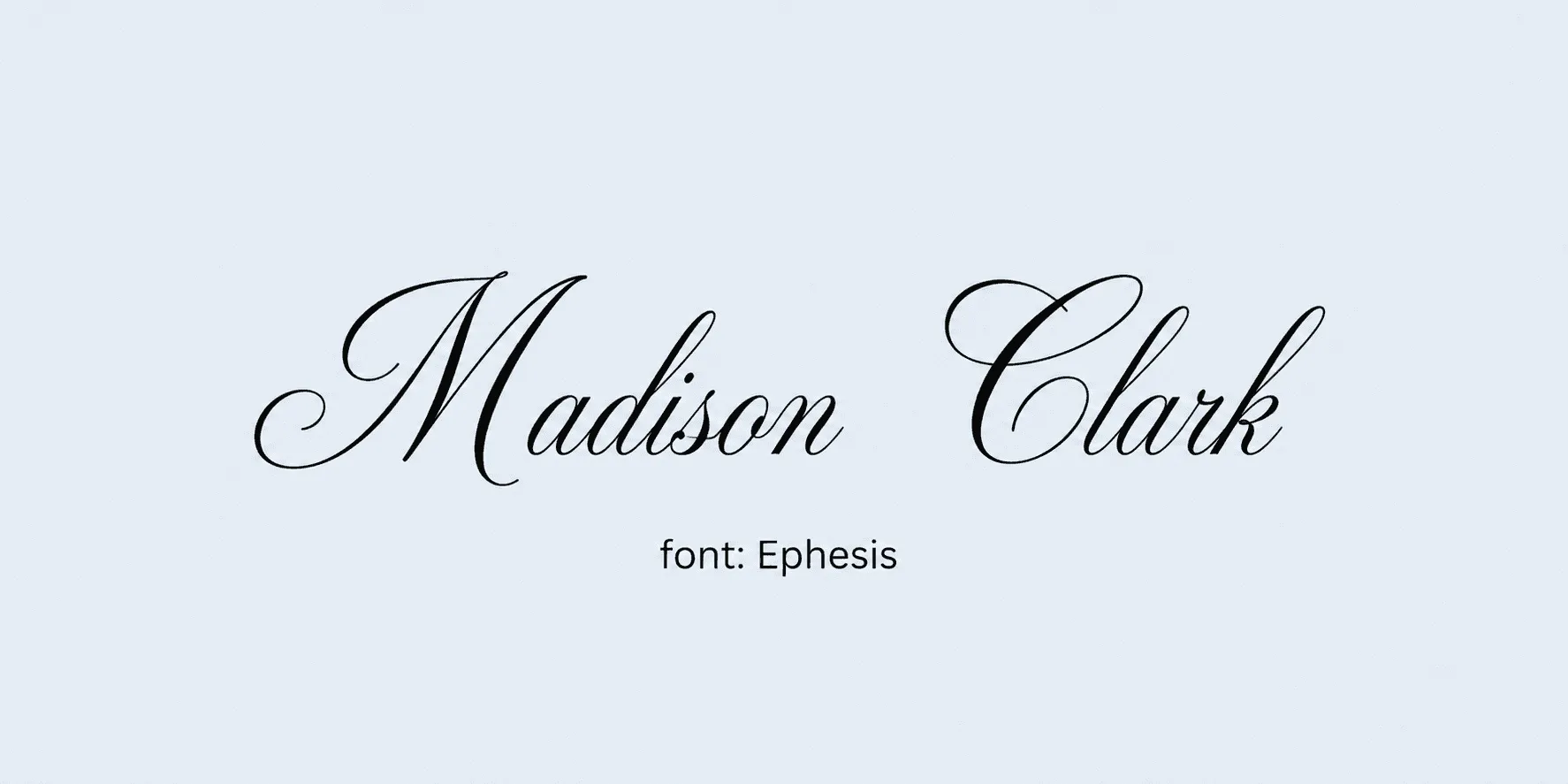
Best for: design and creative fields. Ephesis has a hand-lettered, almost brush-marker quality that feels intentional rather than generic, which is why it tends to show up on creative-field certificates specifically. It's expressive enough to double as a small design accent elsewhere on the page, not just the signature.
11. Sacramento - thin, single-weight, airy.
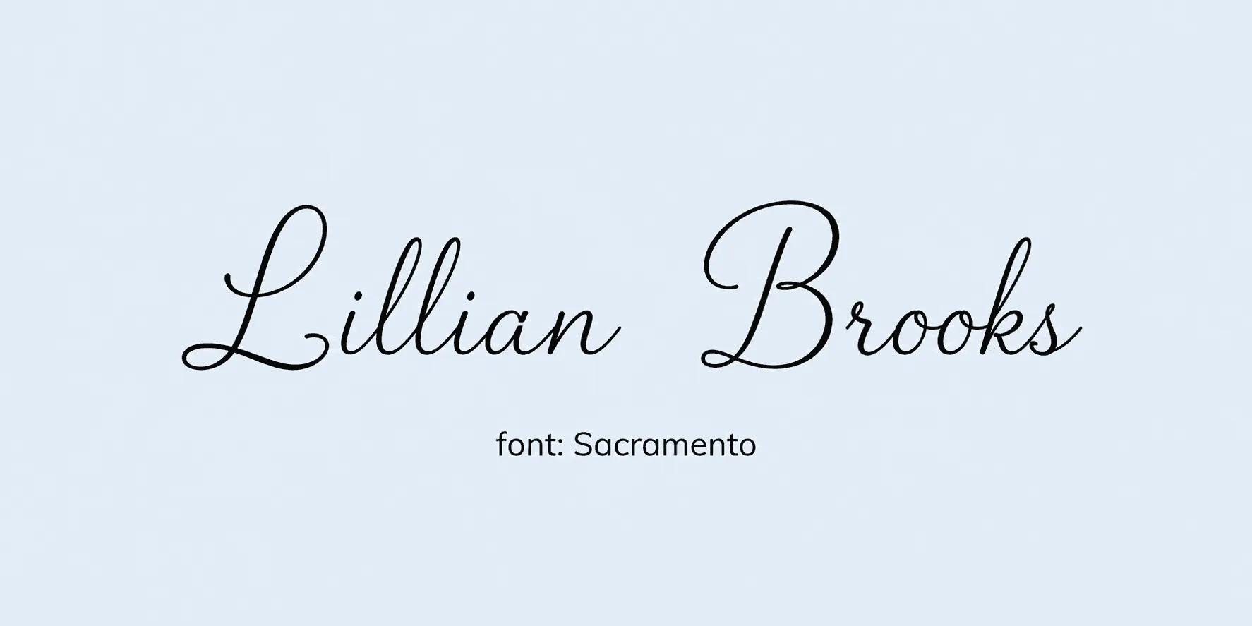
Best for: community programs, informal recognitions. The single-weight stroke keeps Sacramento light and unpretentious, which suits community or volunteer recognitions where a heavier signature style would feel overly formal. Like other thin-stroke scripts, test it at your actual print size before finalizing - the airiness that looks great in a preview can thin out further under low resolution.
12. Allura - elegant, restrained, elongated strokes.
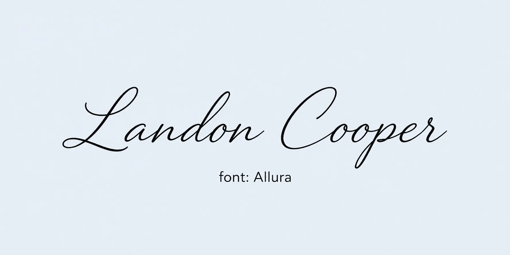
Best for: academic honors. Allura's elongated strokes give it an academic, old-world feel without tipping into the heavier ornamentation of something like Rochester. It's a solid pick for honors and dean's-list style certificates where restraint reads as more credible than flourish.
13. Parisienne - rounded, romantic letterforms.
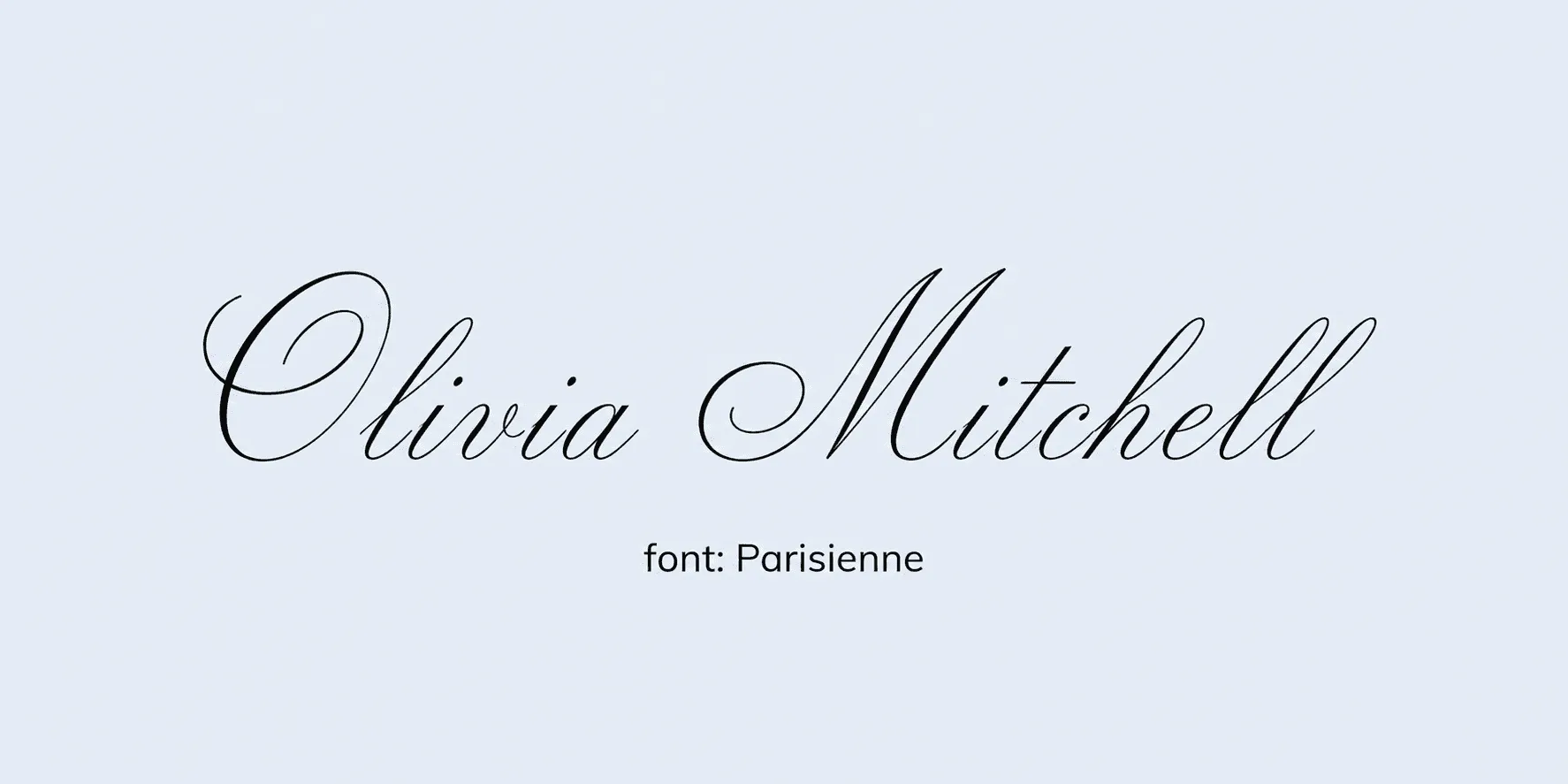
Best for: hospitality and event certificates. The rounded letterforms in Parisienne give it a soft, welcoming feel that suits hospitality training, event completions, or anything with a warmer brand voice. It's less formal than Allura but still reads clearly as a genuine signature style.
14. Yellowtail - bouncy, retro, thick strokes.
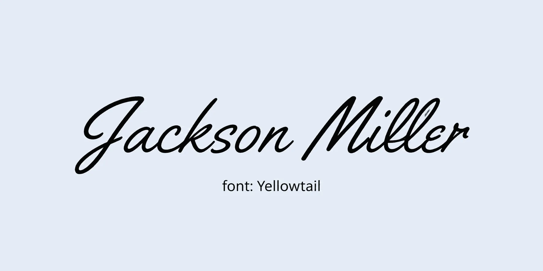
Best for: casual courses, youth programs. Yellowtail's thick, retro strokes make it stand out even at small sizes, which is handy for casual courses or youth-program certificates where legibility matters more than subtlety. It's not the font to pair with a formal, institutional layout.
15. Tangerine - fine old-world calligraphy.
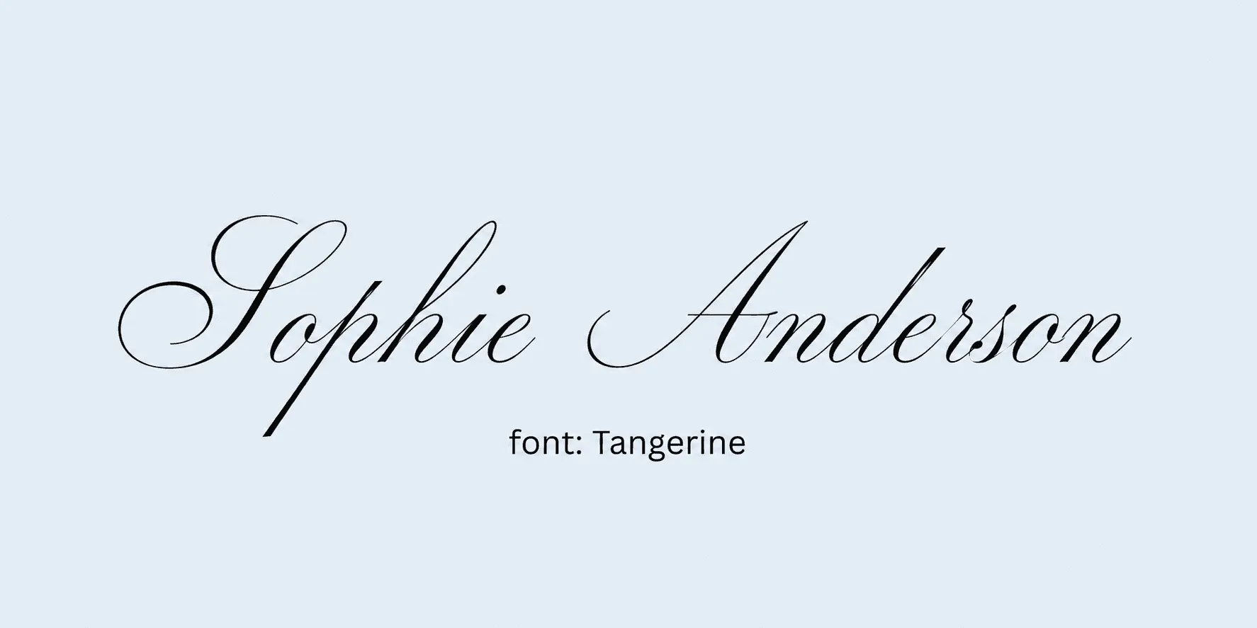
Best for: vintage or heritage-themed certificates. Tangerine's fine calligraphic detail gives it real elegance, but that same thinness means it needs a larger point size than most scripts on this list to stay readable. It's best reserved for vintage or heritage-themed templates that already lean into that old-world aesthetic.
16. Rochester - ornate, traditional, weighty.
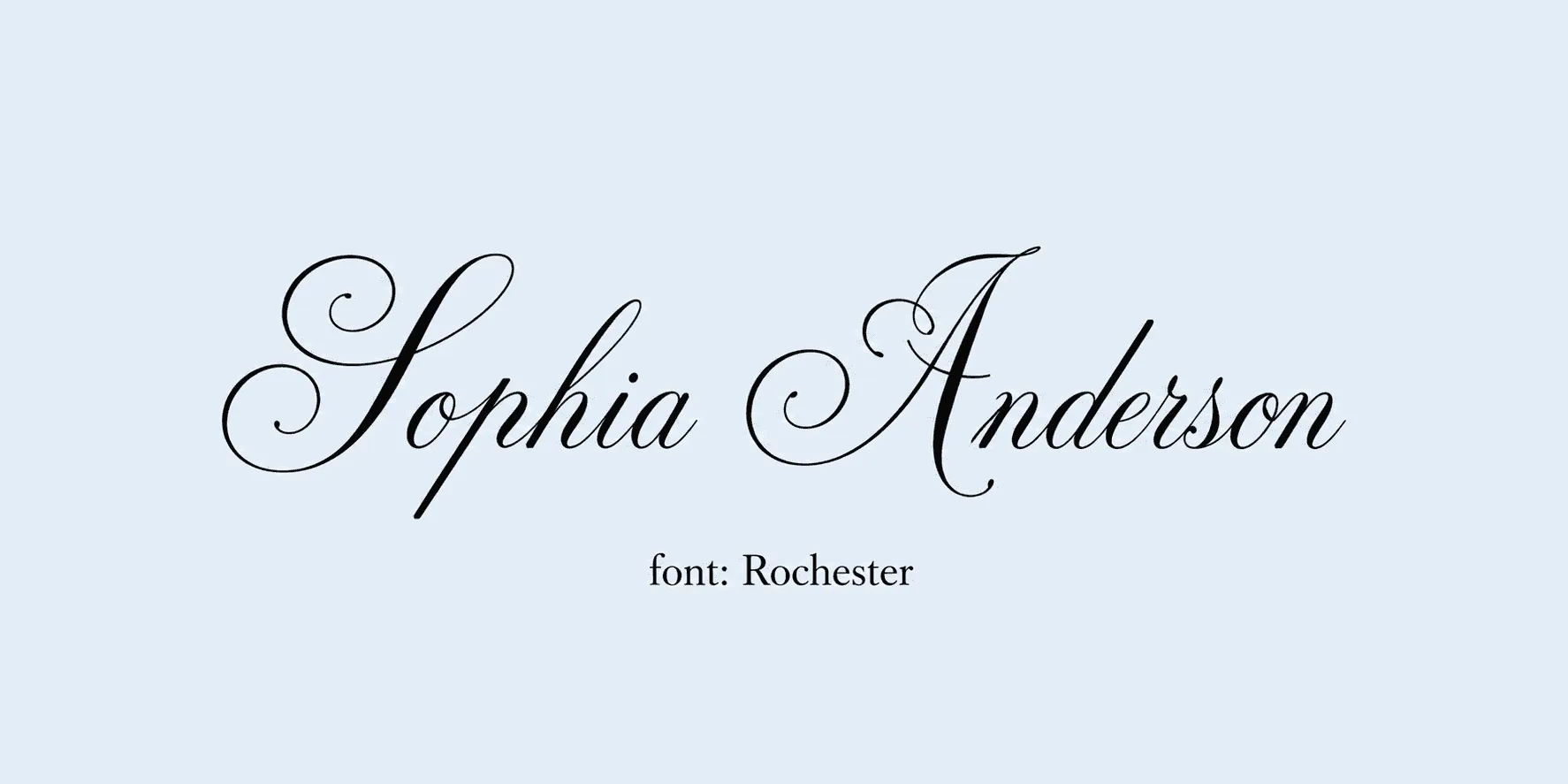
Best for: long-established institutions, formal degrees. Rochester carries enough visual weight to suit institutions with a long history behind them - it reads as established rather than trendy. Because it's more ornate than most true handwriting fonts, it gives it extra breathing room on the page so it doesn't compete with a busy border or seal.
17. Mrs Saint Delafield - tall, dramatic ascenders.
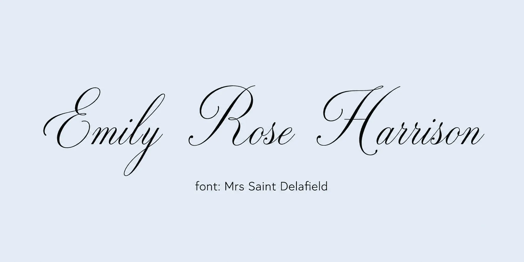
Best for: standout single-signer certificates. The tall ascenders make Mrs Saint Delafield hard to miss, which works well when there's only one signature on the certificate and you want it to feel like a genuine, personal mark rather than an afterthought. With multiple signatures on one page, though, the height can start to crowd the layout.
18. Caveat - looks genuinely pen-written.
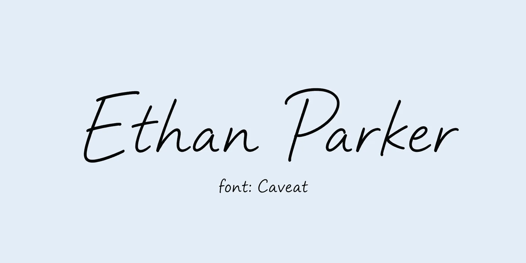
Best for: internal recognitions, notes of appreciation. Caveat is one of the more convincingly pen-written fonts on this list, with just enough irregularity to avoid looking templated. It also has broader character support than most decorative scripts, which makes it a safer choice if you're signing names with accents.
19. Petit Formal Script - compact, upright, careful penmanship.
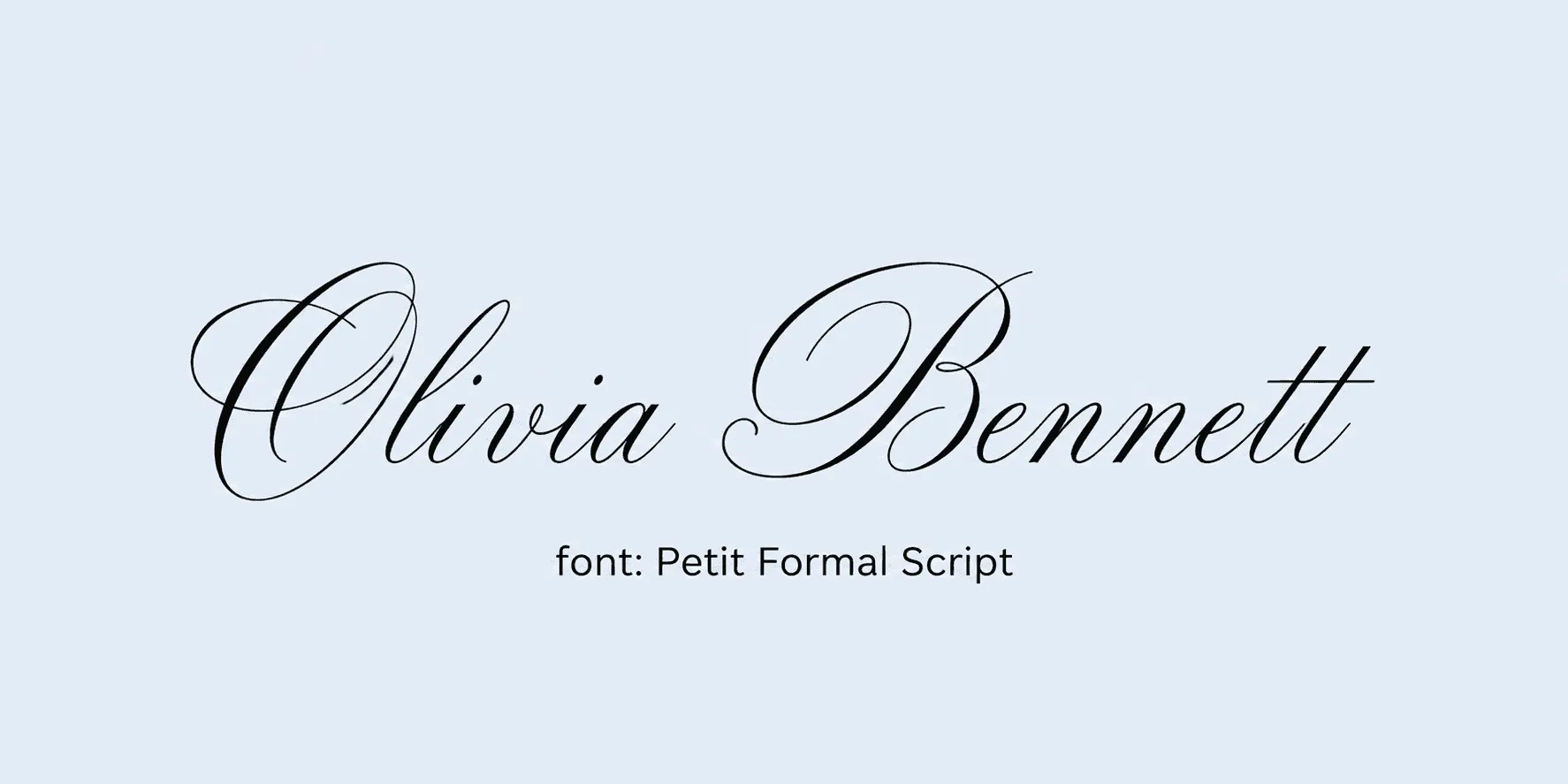
Best for: formal certificates that still need to be read at a glance. Petit Formal Script stays upright and controlled rather than sprawling, so names read clearly even in a compact signature field. It's a good middle ground when you need something that still looks like handwriting but has to fit tightly next to other certificate elements.
20. Homemade Apple - imperfect, marker-on-paper feel.
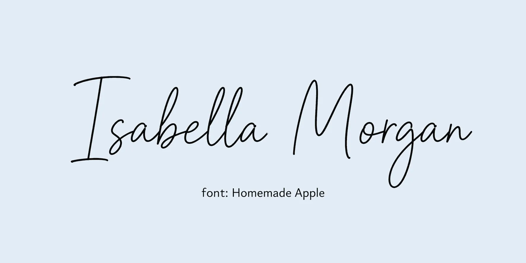
Best for: personal and volunteer recognitions. The slight imperfections in Homemade Apple are the whole point - it reads as genuinely hand-written rather than digitally perfect, which suits personal thank-yous and volunteer recognitions. It adds a personal touch that more polished scripts can't quite match, and pairs naturally with a warmer layout like the ones in ourprintable appreciation certificate templates.
21. Ruthie - loose, casual cursive with a friendly wobble.
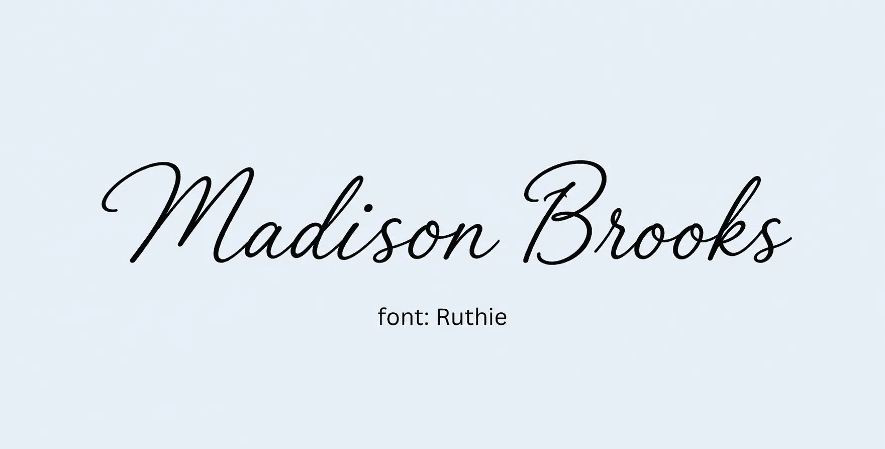
Best for: informal workshops, appreciation certificates. Ruthie's slight wobble keeps it from looking mechanically generated, giving it a friendly, informal feel that suits workshop completions or appreciation certificates rather than anything with high institutional stakes.
22. Herr Von Muellerhoff - delicate, old-fashioned calligraphic script.
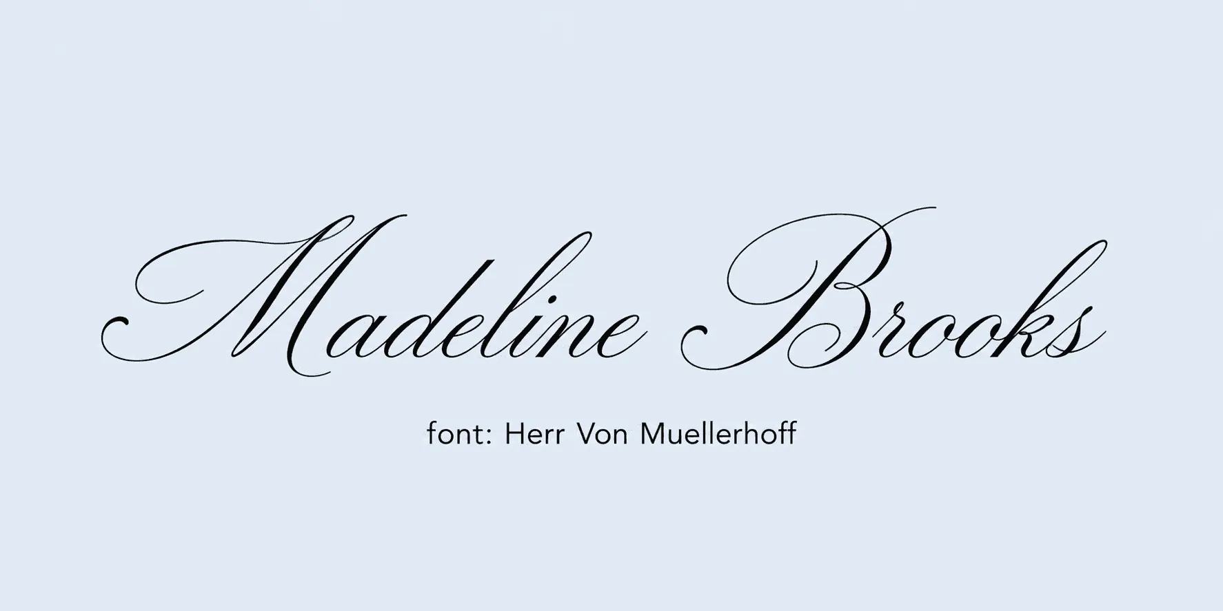
Best for: formal ceremonies, heritage brands. This one leans further into classic calligraphy than most others in Section 1, which makes it a strong match for heritage brands or ceremony-style certificates where a more elaborate, old-fashioned signature style is actually the goal.
23. Jim Nightshade - scratchy, hand-inked cursive with real personality.
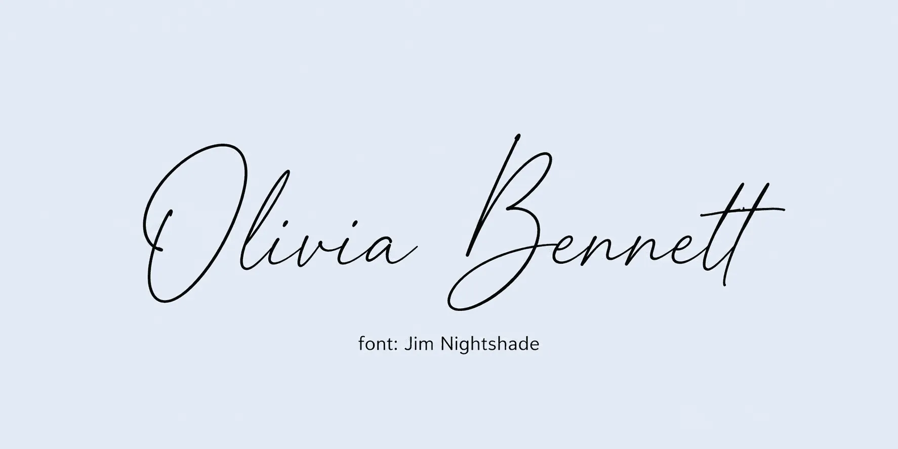
Best for: creative or nontraditional programs; skip it for anything conservative. Jim Nightshade has more personality than legibility, so it's best used where the certificate's whole design is already leaning creative or nontraditional. On a conservative, corporate template it will read as mismatched rather than distinctive.
24. Italianno - long, sweeping, elegant loops.
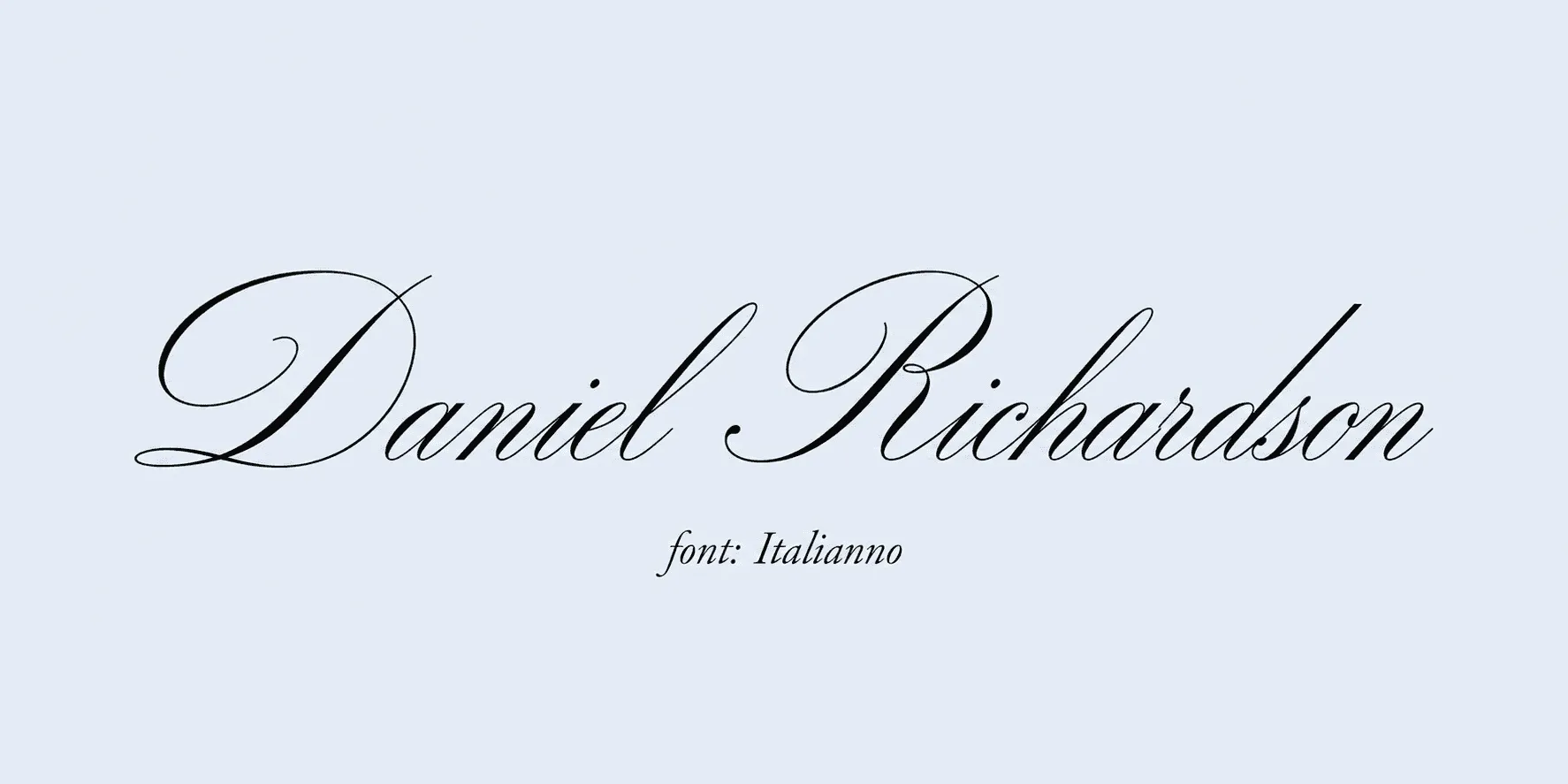
Best for: wedding-adjacent or luxury-brand certificates. The sweeping loops in Italianno give it a luxury-brand feel that fits naturally with wedding-adjacent certificates or anything positioned as a premium credential rather than a routine one.
25. WindSong - soft, flowing, modern script.
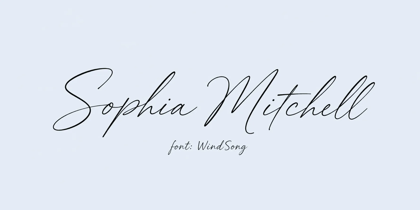
Best for: lifestyle brands, wellness program certificates. WindSong keeps a soft, flowing quality without feeling old-fashioned, which is why it tends to suit modern lifestyle or wellness brands better than the more traditional scripts on this list.
26. Mea Culpa - casual, slightly imperfect handwriting.
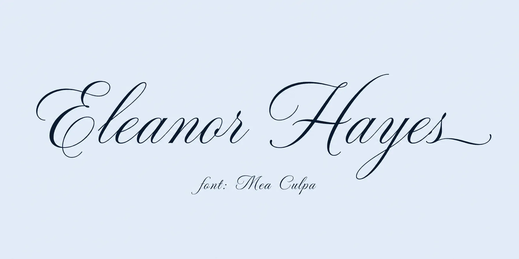
Best for: everyday recognitions, thank-you certificates. Like Homemade Apple, Mea Culpa trades polish for authenticity, which makes it a good match for everyday, low-stakes recognitions where a slightly imperfect signature style actually reads as more sincere.
27. Cookie - rounded, friendly script.
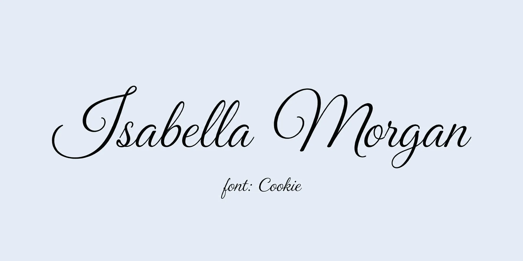
Best for: community and hobby-program certificates. Cookie's rounded shapes keep it light and approachable, closing out Section 1 with one more genuinely handwriting-style option for community and hobby-program certificates where a formal signature style would feel out of place.
Section 2: Formal Fonts for Certificate Brand and Formality
These read as polished and credible, but they're built for titles, body copy, and certifying-body names - not for mimicking a handwriting signature. Pair one of these with a Section 1 script rather than using it as the signature itself; the contrast between the two is part of what makes a certificate's brand and formality feel intentional.
28. Cormorant Garamond - refined, editorial serif.
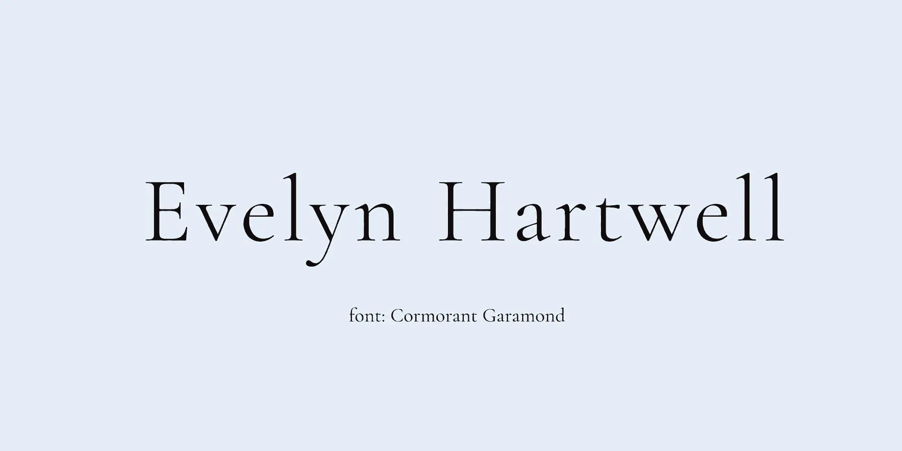
Best for: body text on academic certificates. Cormorant Garamond has an editorial, almost literary quality that works well for longer blocks of body copy where readability at small sizes matters more than personality.
29. Cinzel - Roman capital-inspired, formal and monumental.
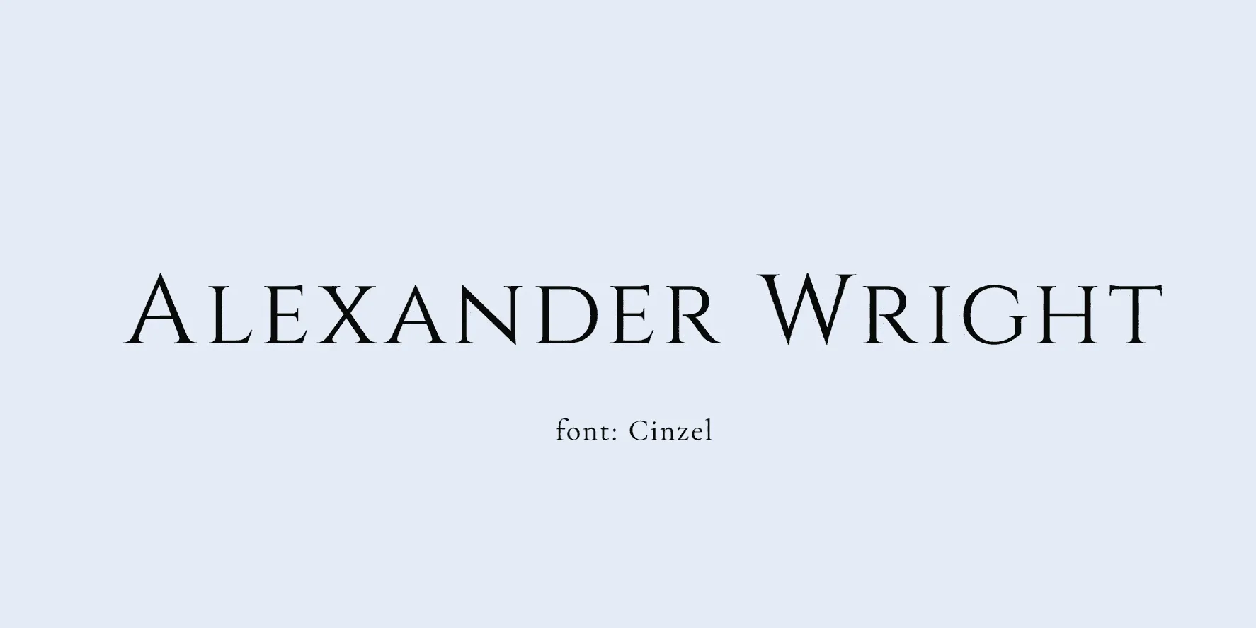
Best for: titles on classical or academic credentials. Because Cinzel is built around capital letters, it's better suited to short titles than full sentences - it gives academic or classical credentials a monumental, carved-in-stone feel without needing an actual seal.
30. Libre Caslon Display - bold, classic serif.
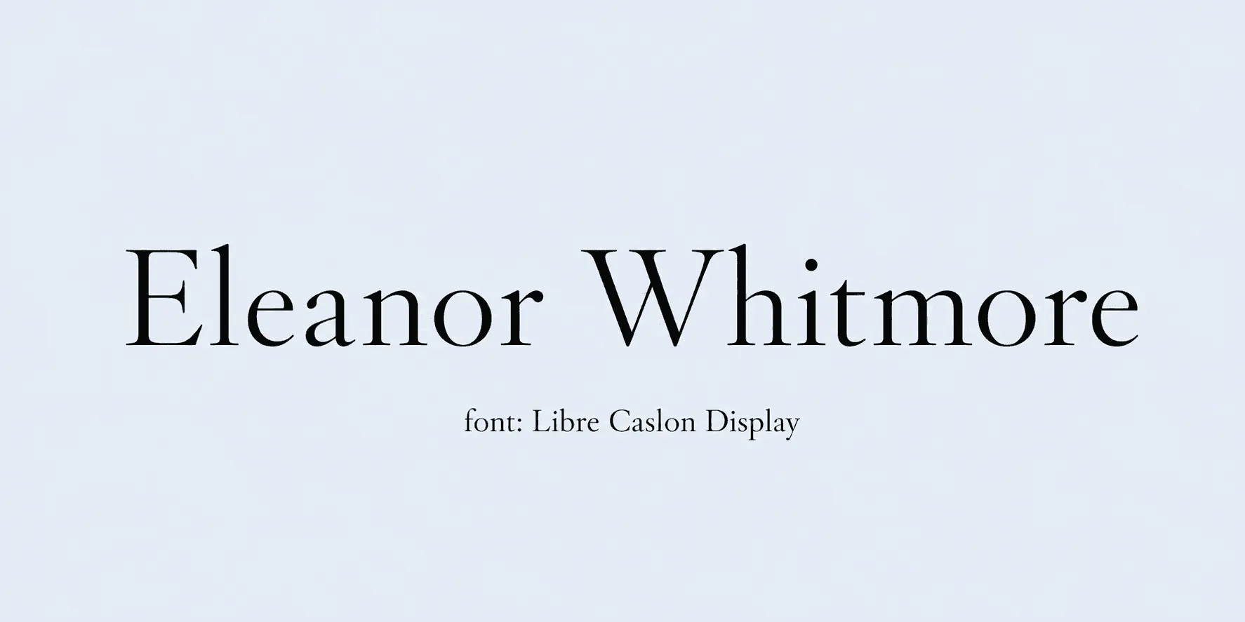
Best for: headline text, institution names. Libre Caslon Display carries enough weight to anchor an institution's name at the top of a certificate, giving the whole layout a sense of established credibility before a reader even gets to the signature line.
31. Sorts Mill Goudy - warm, old-style serif.
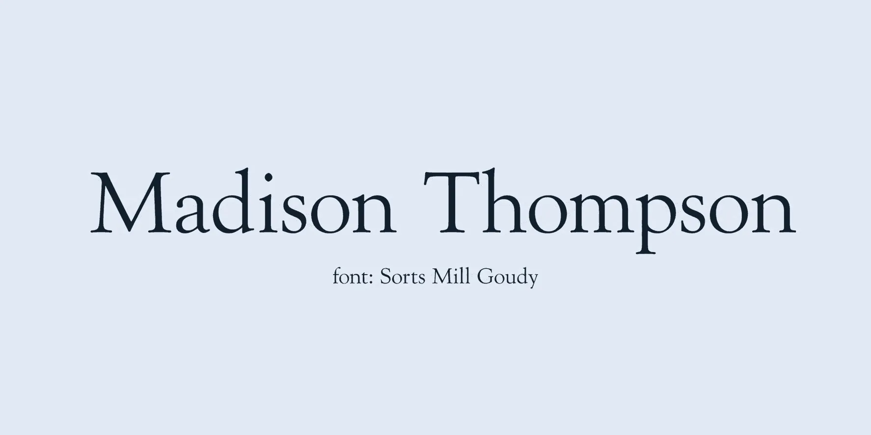
Best for: body copy on traditional certificates. Sorts Mill Goudy has a warmer, slightly old-style feel than most body fonts, which suits traditional certificate templates that want to feel timeless rather than sharply modern.
32. Spectral - modern serif with good readability at small sizes.
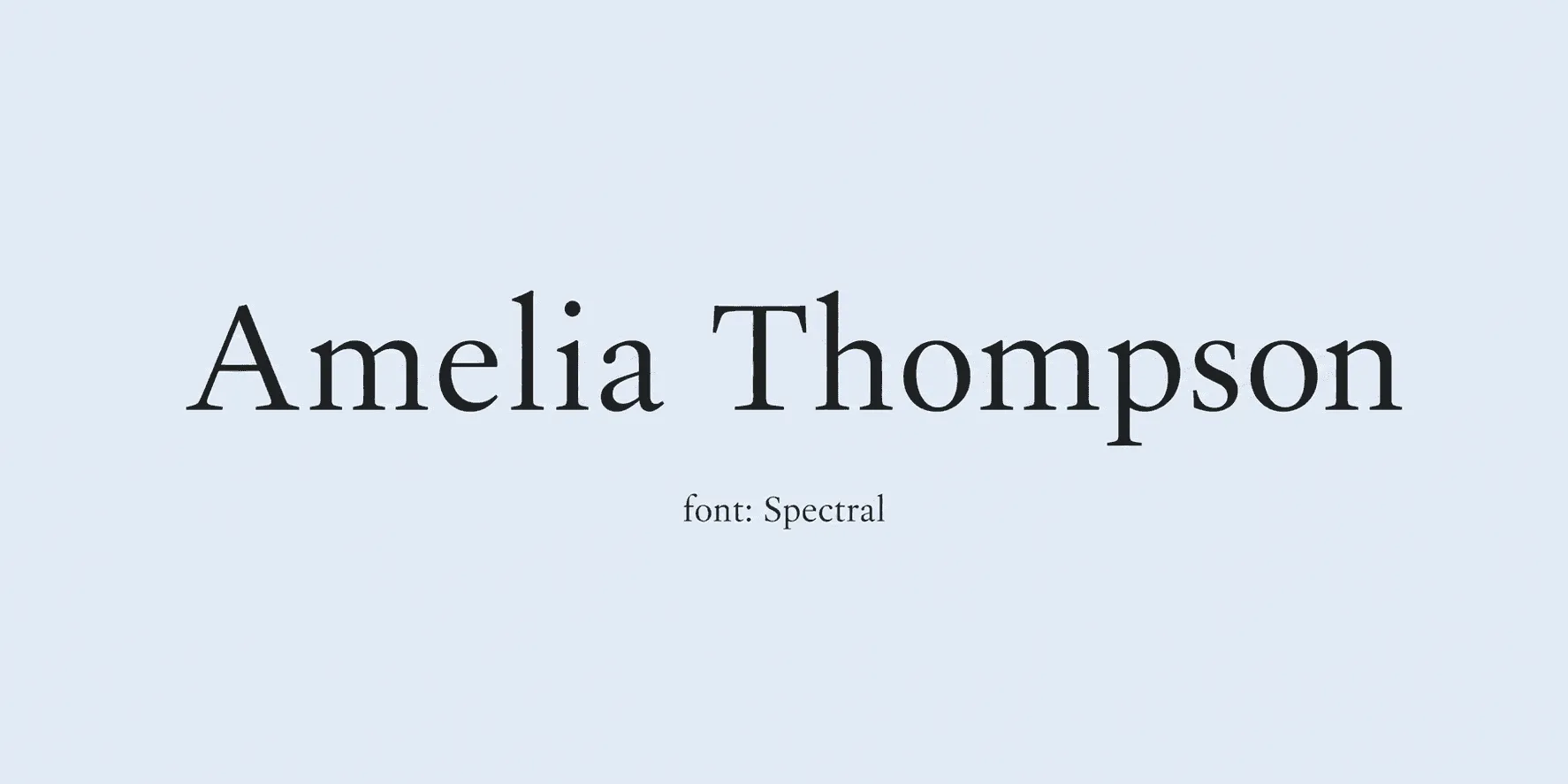
Best for: dense certificate text, fine print. Spectral was built with digital readability in mind, so it holds up well in dense sections of certificate text - terms, conditions, accreditation details - where legibility matters more than character.
33. Cardo - scholarly, book-like serif.
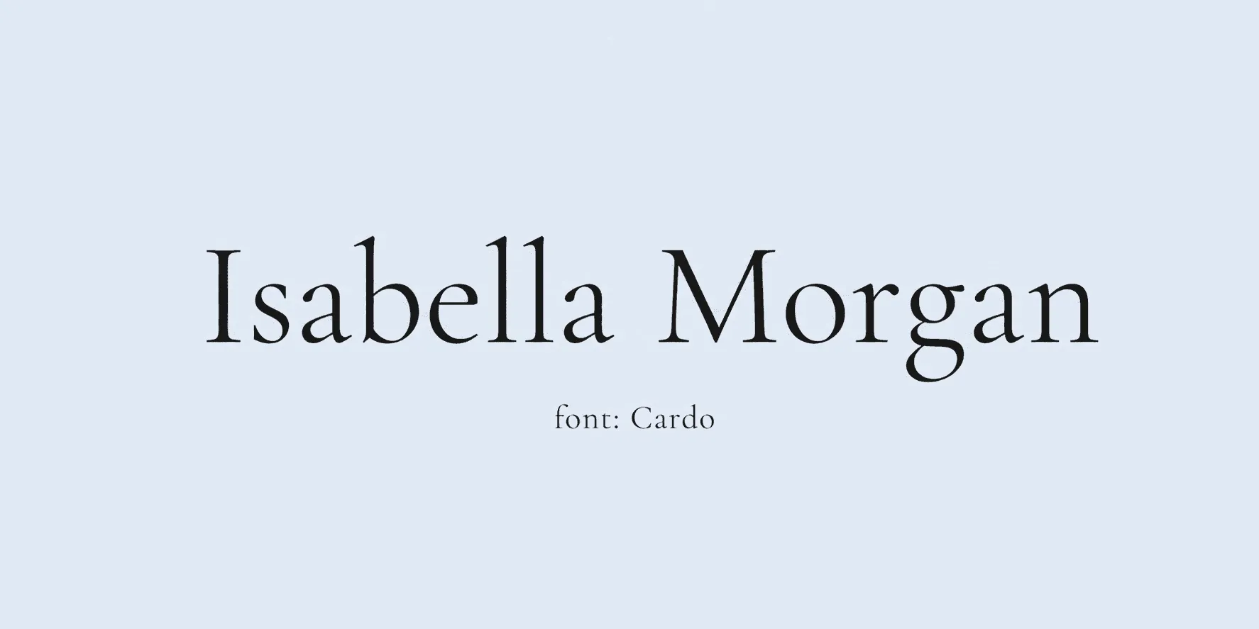
Best for: academic and research credentials. Cardo's book-like proportions make it feel at home on academic and research credentials, especially where the certificate needs to reference citations, standards, or longer institutional names.
34. Philosopher - geometric serif/sans hybrid.
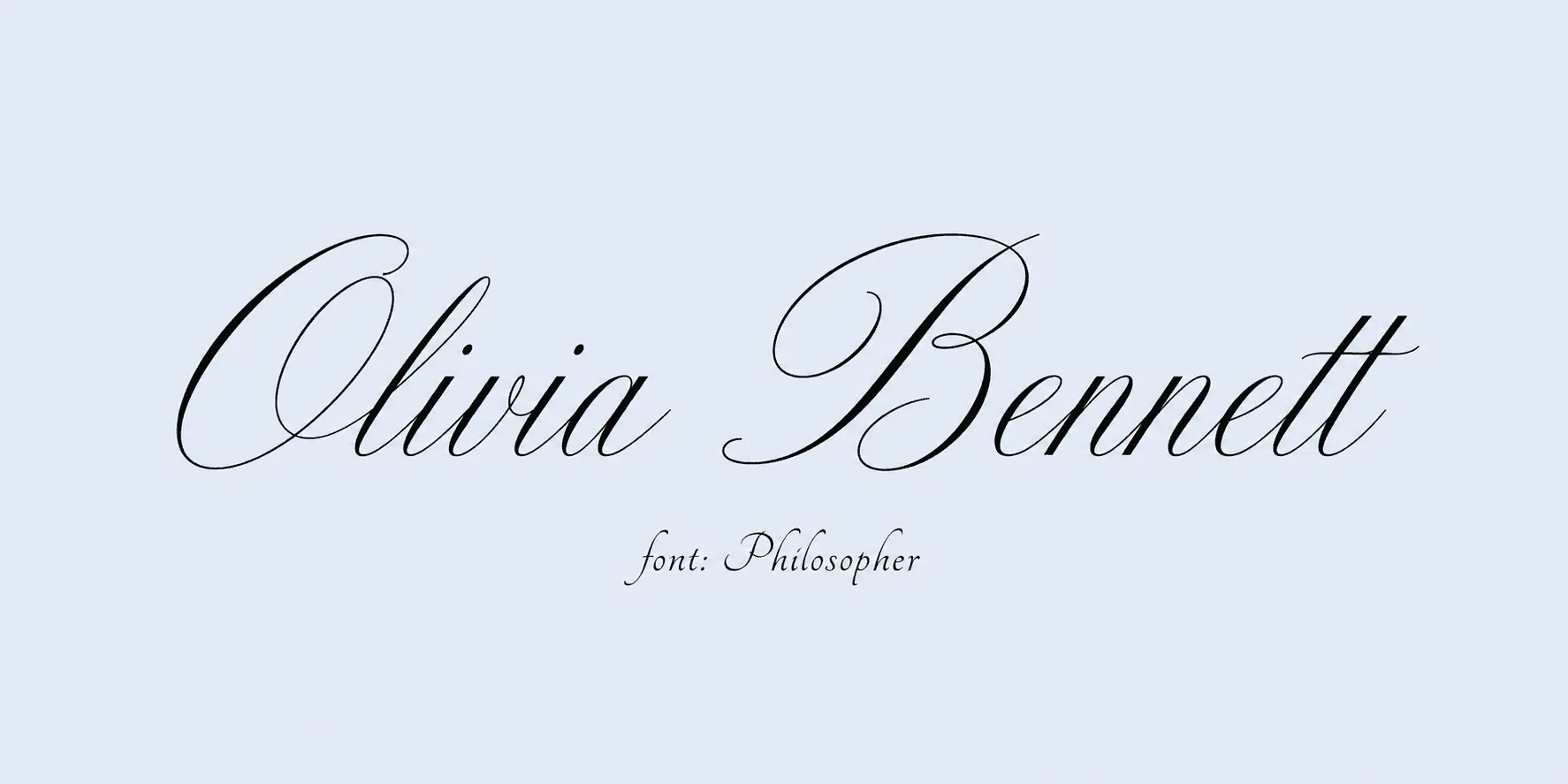
Best for: modern, minimal certificate designs. Philosopher splits the difference between geometric and traditional letterforms, which makes it a flexible pick for minimal, modern certificate designs that still want a touch of formality.
35. Didact Gothic - clean, simple sans serif.
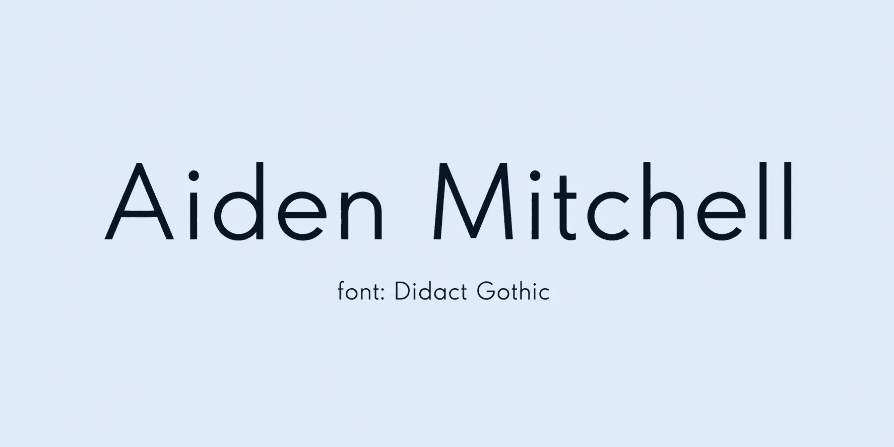
Best for: instructional text, fine print, disclaimers. As the one sans serif option in this section, Didact Gothic is built purely for clarity - it's the right choice for disclaimers, fine print, or any instructional text where decoration would just get in the way of easily read information.
Section 3: Decorative and Blackletter Fonts for Certificate Titles and Seals
These decorative fonts bring a historic, stamped, or "official seal" feel. They work well for a title, crest text, or a decorative flourish near the signature - but they're gothic lettering, not cursive, so they shouldn't be mistaken for a signature font.
36. Uncial Antiqua - rounded medieval lettering.
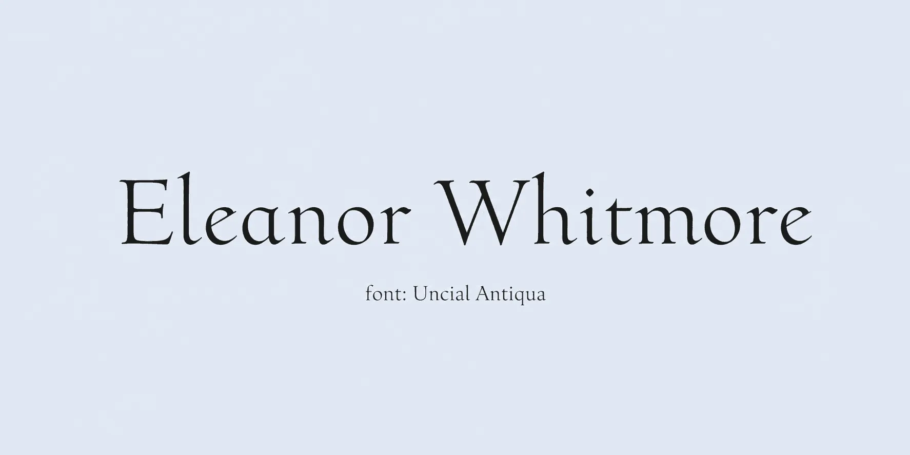
Best for: heritage or ceremonial titles. Uncial Antiqua's rounded, medieval letterforms give ceremonial titles a distinct, old-world identity without going as heavy as full blackletter - it's a gentler entry point into the decorative category.
37. Cinzel Decorative - ornamental variant of Cinzel.
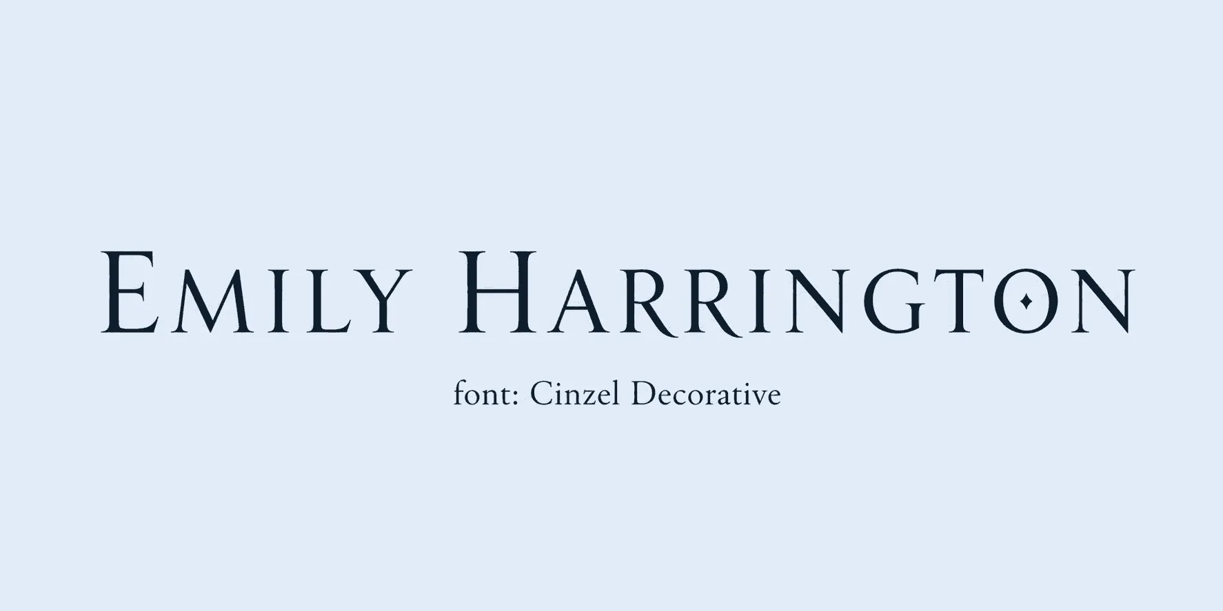
Best for: short decorative headings, seals. This variant adds ornamental flourishes to Cinzel's capital-driven structure, which is why it works best in short bursts - a heading or a seal element - rather than across a full line of text.
38. UnifrakturCook - dense gothic blackletter.
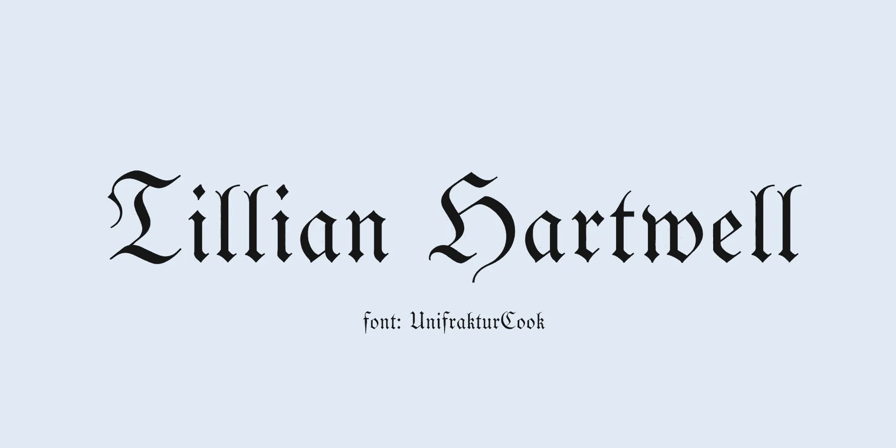
Best for: old-world or guild-style certificates, used sparingly. UnifrakturCook is about as far from a signature font as this list gets - dense, gothic, and best used sparingly, since its heaviness can overwhelm a page if it appears in more than one or two places.
39. Almendra Display - dramatic, slightly gothic serif.
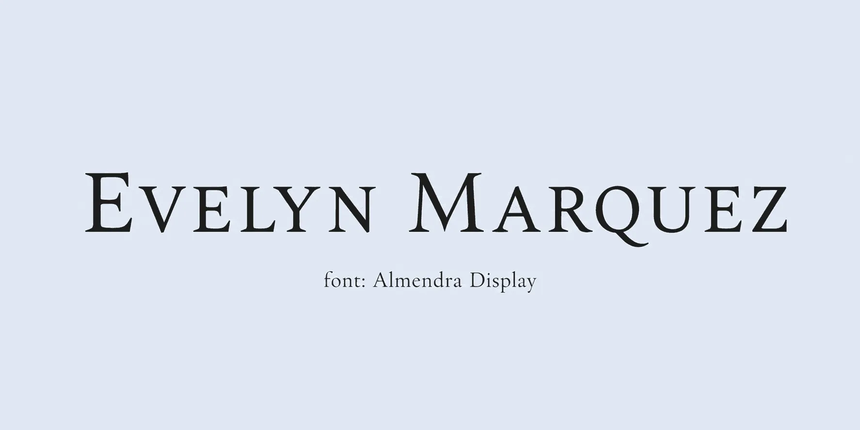
Best for: short titles on themed certificates. Almendra Display keeps some of blackletter's drama without going fully gothic, making it a middle-ground choice for themed certificates that want a decorative title without losing all readability.
40. Metamorphous - heavy, fantasy-leaning serif.
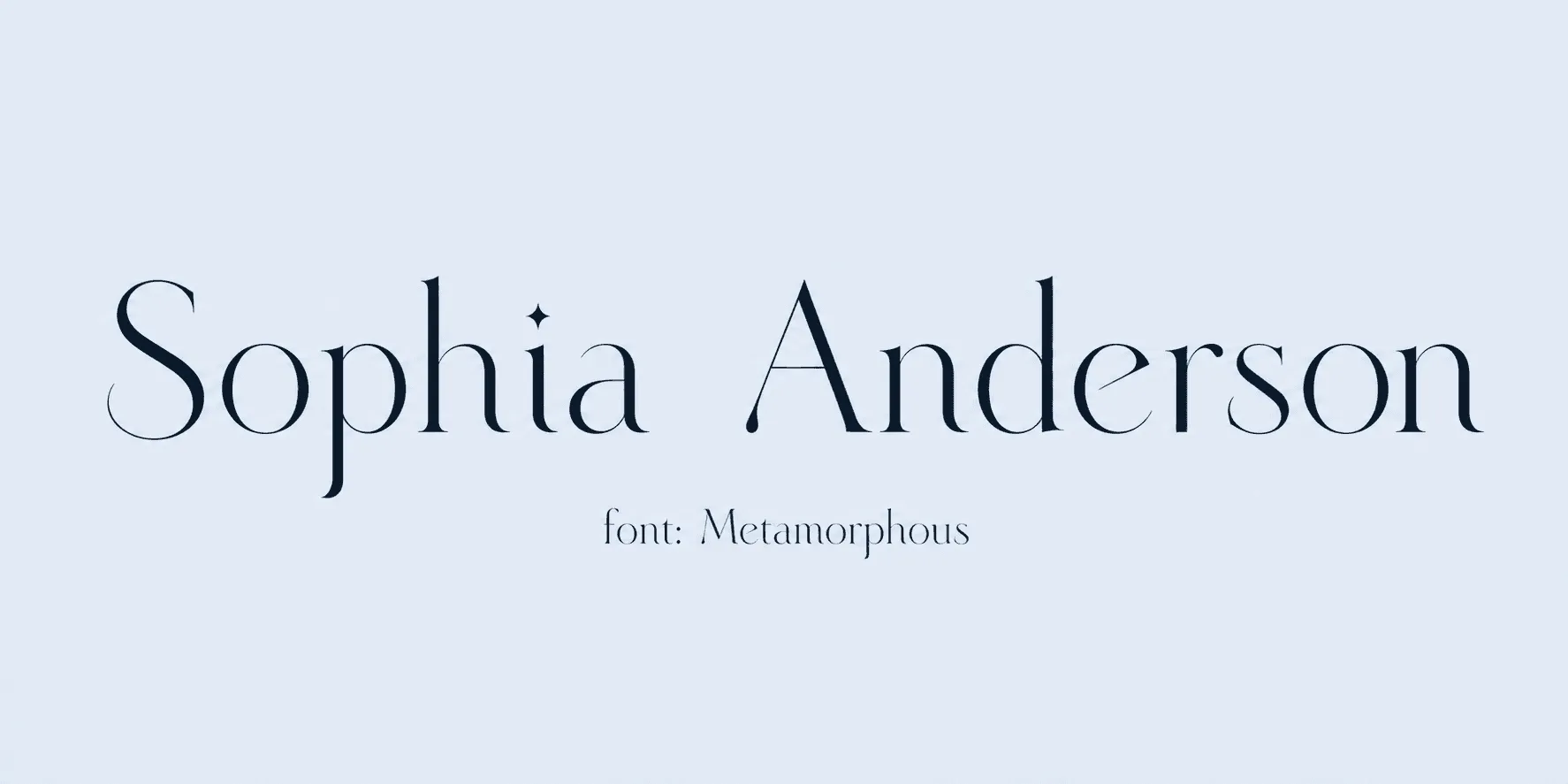
Best for: niche, theatrical, or themed credentials - not general use. Metamorphous leans hard into a fantasy, theatrical aesthetic, so it's really only a fit for niche, themed credentials - it's not a font to reach for on a standard formal or corporate certificate.
Choosing the Best Signature Font for Readability
A signature font's whole job is to look like a person actually signed it. If a font that looks like a decoration rather than a name makes you stop and second-guess it, it's failed that job - no matter how nice it looks in a preview. That's the one rule that matters more than the rest of this list.
A few practical checks help you get from "looks nice" to actually the best signature font for your certificate:
- Test at the real name length. A short name and a long, hyphenated name behave very differently in the same font, especially with scripts that have exaggerated entry or exit strokes.
- Check readability at the real font size, not the zoomed-in preview. Thin-stroke scripts in particular can blur or thin out further once printed or shared as a digital credential - see our guide to ideal printable certificate size, resolution, and format for the specifics.
- Match formality to the certificate's purpose. A casual course completion and a formal board appointment call for very different points on the handwriting-font spectrum, even though both are technically "signature fonts."
- Watch font usage across the page. One script for the signature and one plain, easily read serif or sans serif for the rest of the certificate keeps the document from feeling cluttered - two competing decorative fonts tend to fight for attention.
- Confirm character support for the names you're issuing to. If you're sending digital credentials internationally, some scripts handle accented names far better than others.
Where a font actually gets used matters just as much as which one you pick. A font for signature use should sit in the signature field alone - not the recipient's name, not the body copy. Save formal or decorative options for the certificate's title, certifying body name, or seal, and keep the signature line reserved for a genuine handwriting style.
Wrapping Up
Forty fonts is plenty of choice, but the real decision is much smaller than it looks: pick a genuine handwriting font from Section 1 for the signature itself, and if you want a more formal or historic feel elsewhere on the certificate, pull from Section 2 or 3 for the title and body text instead of trying to make one font do both jobs. Font choice is just one piece of the puzzle - our how-to guide on designing certificates that perform covers the rest of the layout decisions that go into a certificate people actually keep.
If you're issuing certificates on Wauld, you can preview any of these against your actual recipient names before sending a batch out - so you're never guessing how a script holds up until it's already out the door.