


Guide to Certificate Fonts
Think about the last certificate you actually kept. Maybe it's pinned above a desk, tucked into a folder you reopen occasionally, or photographed and shared online. Chances are, the typography played a bigger role in that decision than you realized - a clumsy font choice can make even a genuine achievement feel like a template nobody put thought into.
That's the real challenge with certificate fonts: it's easy to default to whatever your design tool opens with, and harder to actually pick something intentional. This guide skips the guesswork. We'll walk through the best font for certificates, grouped by the vibe each one brings to the table, plus the sizing rules and pairing tricks that separate an amateur-looking handout from something a recipient actually wants to frame.
What Makes a Good Certificate Font in the First Place?
A typeface is never just decoration. It's doing real work - setting the mood, signaling formality, and determining whether the recipient's name is the first thing a reader's eye lands on or something they have to squint at. Certificate fonts carry the emotional weight of the document: a flowing script whispers "ceremony," a clean sans-serif says "professional and modern," and a heavy serif says "this has been around for a hundred years and isn't going anywhere."
Get the font choice wrong, and even a beautifully designed certificate can feel cheap or hard to read. Get it right, and the typography quietly does half the persuading for you.
Serif Font vs. Sans-Serif Font for Certificates: The Basics
Before picking individual names, it helps to understand the two camps almost every certificate font falls into.
Serif Fonts: The Traditional Choice
Picture little "feet" sitting at the ends of each letter. That's a serif font - the traditional serif family that's been the backbone of academic certificates, diplomas, and formal awards for decades. These little strokes add a sense of heritage and authority, which is exactly why serif fonts print so beautifully on physical certificates that get framed and hung on walls.
Sans-Serif Fonts: The Modern Choice
Strip those feet away and you get a sans-serif font - clean, minimal, and built for screens. If your certificates live mostly as PDFs, get emailed out, or show up on a phone, a modern sans-serif keeps legibility high no matter how small the text gets.
Neither style is objectively "better." The right one depends entirely on where your certificate is headed and who's going to see it.
The Best Fonts for Certificates, Grouped by Vibe
Rather than dumping 40 names on you in one long list, here's how each font from our roundup actually feels in practice - so you can match the font style for certificate design to the occasion by selecting an excellent choice for certificates that reflects the event's significance.
01 - Quietly Elegant Serifs: EB Garamond, Cormorant Garamond, Libre Baskerville
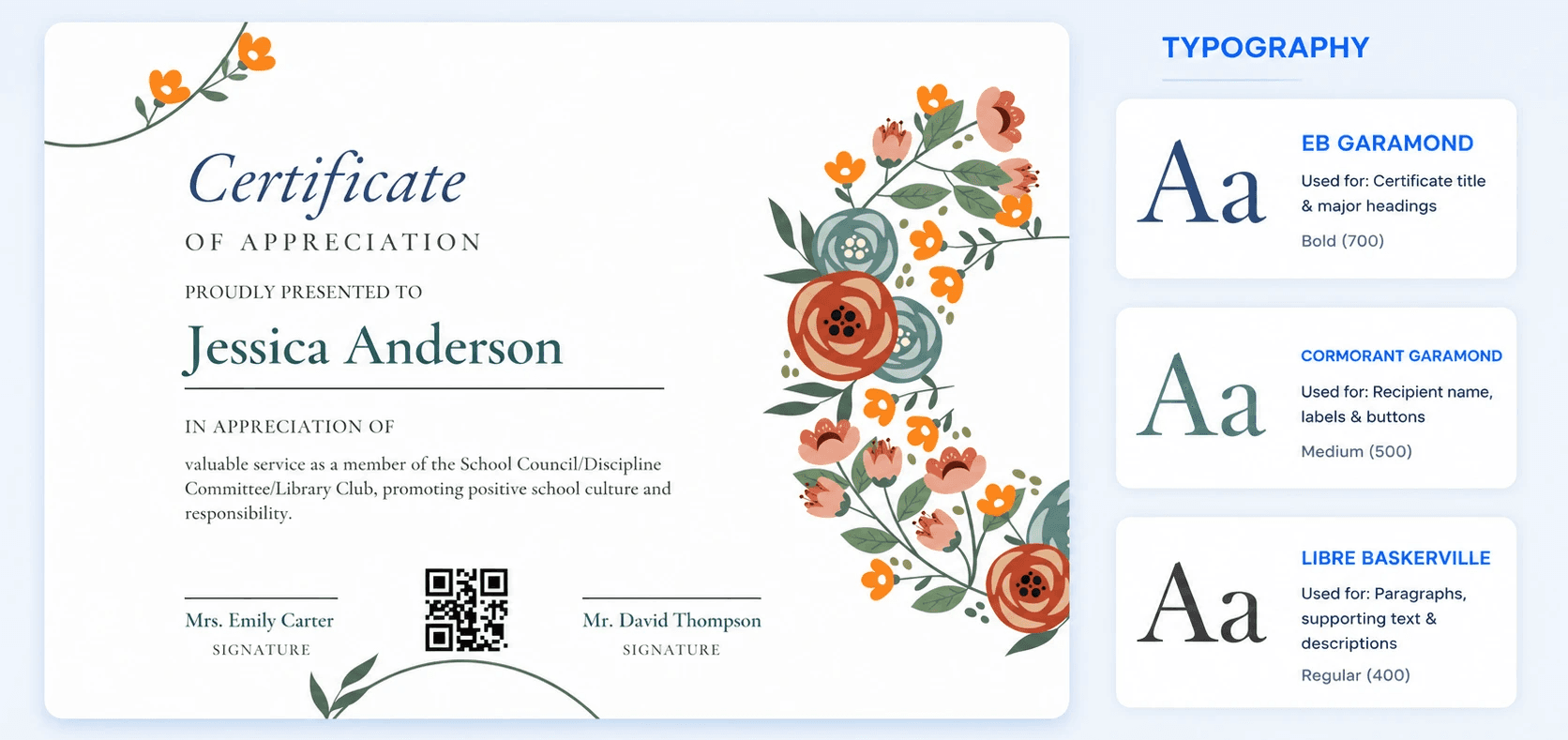
EB Garamond has that old-style, literary quality - the kind of calligraphy that adds elegance to any certificate, traditional serif makes an honors document or academic award feel like it belongs in a leather frame. Cormorant Garamond takes the same old-world DNA and refines it further, adding fine hairline strokes and a distinctly high-fashion feel that's particularly striking when the recipient's name is set large. Libre Baskerville rounds out the trio with slightly crisper, more contemporary letterforms - timeless elegance without tipping into anything stiff or overly historical.
Also worth exploring in this category: Spectral, Cardo, Sorts Mill Goudy.
02 - Bold and Dramatic: Playfair Display, Cinzel, Sorts Mill Goudy
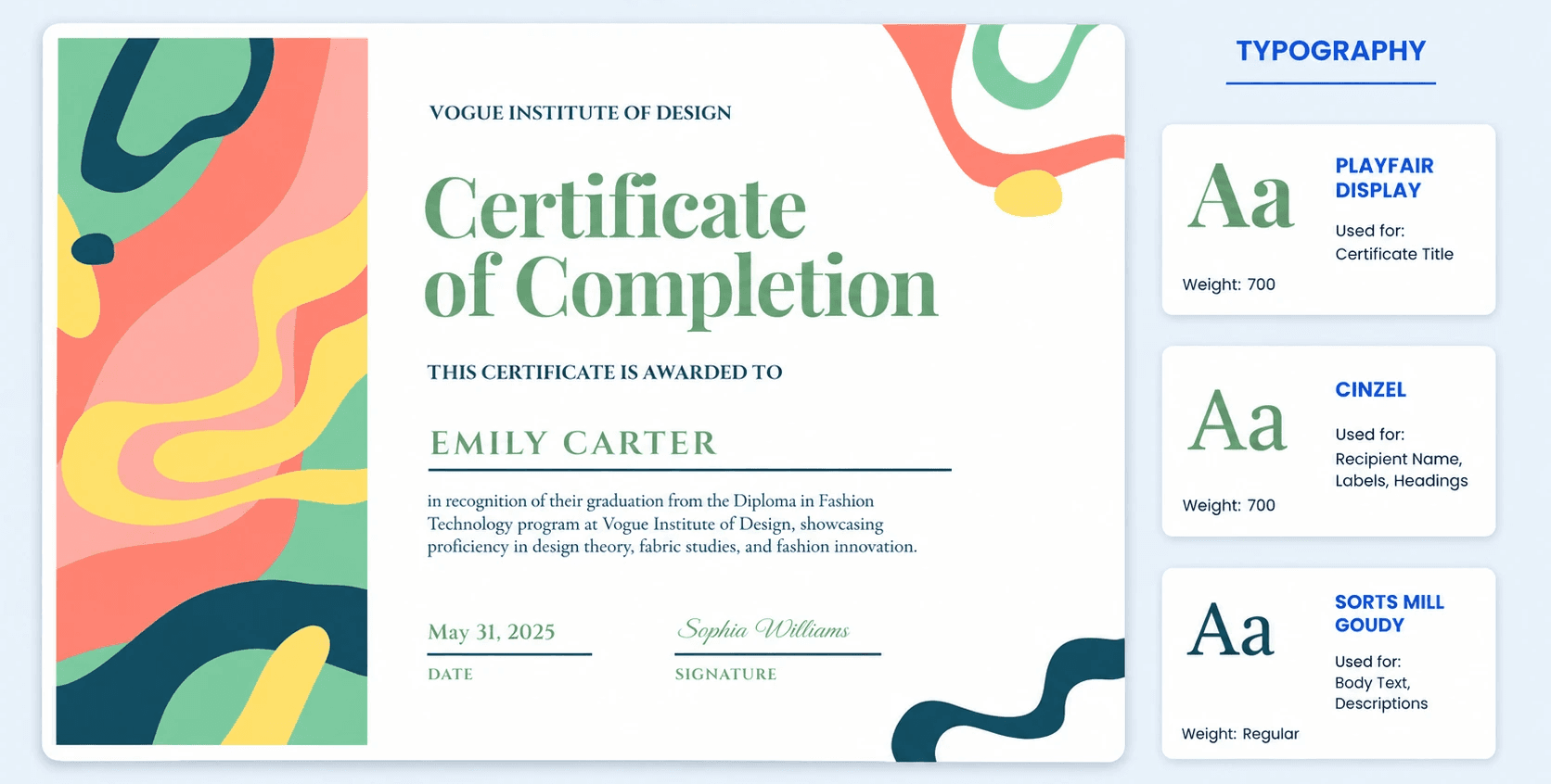
When the title needs to make an entrance, Playfair Display brings high-contrast drama - thick strokes meeting razor-thin hairlines in a way that commands attention. It's a best certificate font pick for headers where you want a real touch of elegance before anyone reads a word of body copy. Cinzel draws directly from classical Roman inscriptions, giving certificates a monumental, carved-in-stone authority that suits honors and awards perfectly. Sorts Mill Goudy adds warmth to the drama with its rounded, humanist qualities - authoritative but never cold, making it a legible choice for certificates.
Also worth exploring in this category: Libre Caslon Display, Almendra Display.
03 - Refined Literary Serifs: Playfair, Spectral, Cardo
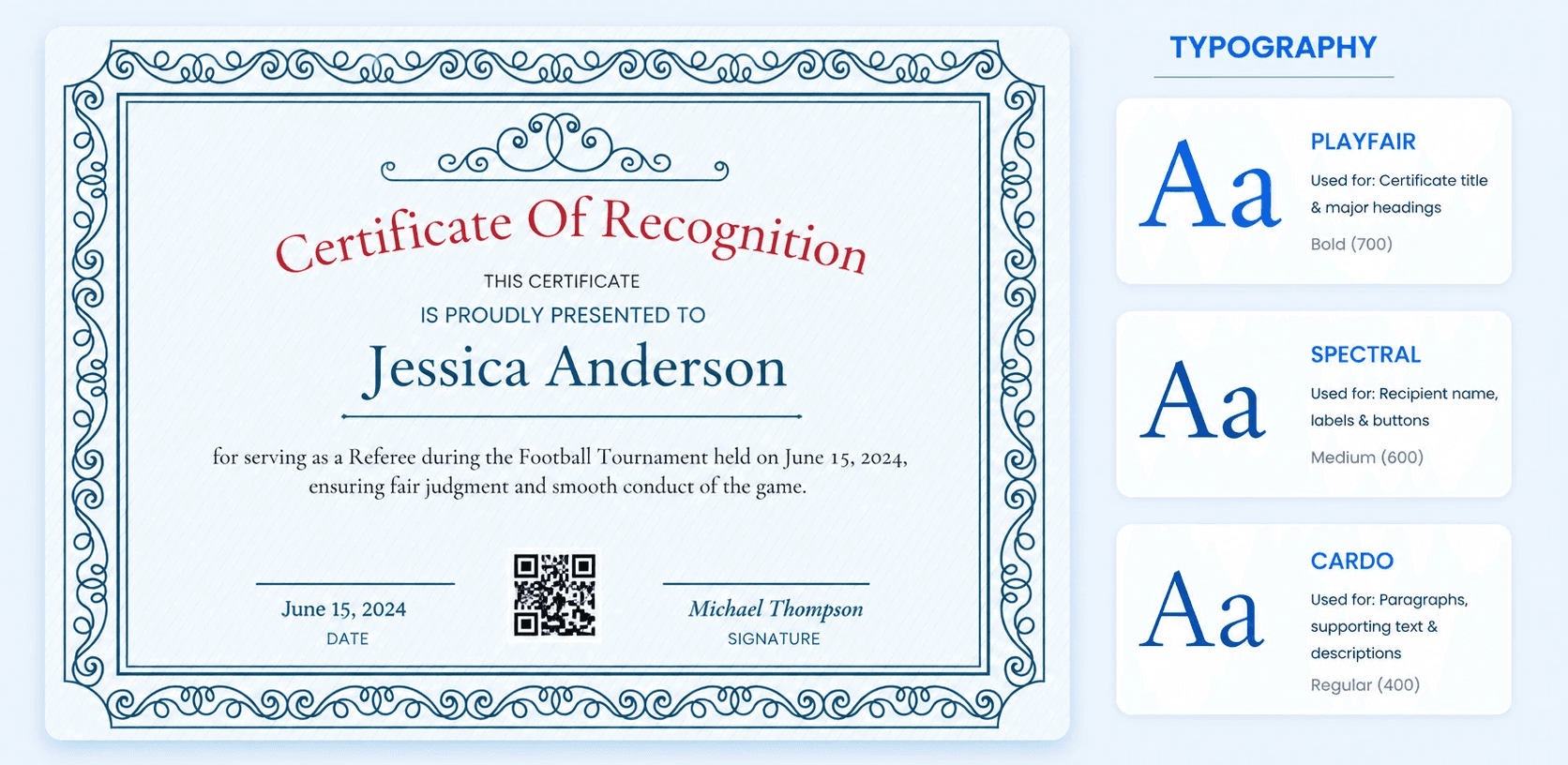
Not every serif needs to shout. Playfair has a subtle contrast between thick and thin strokes - polished and editorial. Spectral was designed specifically for digital reading, making it a smart pick for certificates that live as PDFs or on-screen documents where readability has to hold up at varying sizes. Cardo has an almost scholarly quality, drawing on classical book typefaces to give certificates a quiet, understated formality that feels genuinely considered.
Also worth exploring in this category: Noto Serif, Philosopher.
04 - Clean and Contemporary Sans-Serifs: Roboto, Inter, Noto Sans
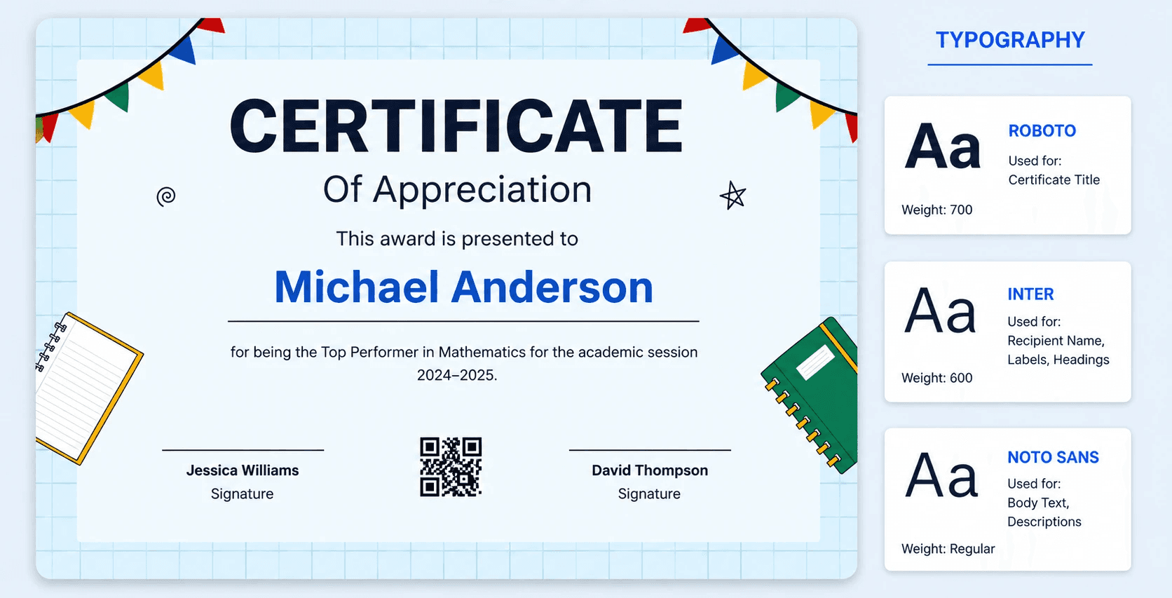
If your certificate is going digital, this trio is where you start. Roboto is the reliable, do-anything sans-serif font that looks at home in almost any context - corporate certificates, training completions, digital badges, you name it. Inter was engineered specifically for screen legibility, so small print - dates, credential IDs, fine print - stays sharp even at tiny sizes. Noto Sans holds up across languages and devices, making it the safest pick for certificates issued to a global audience.
Also worth exploring in this category: Didact Gothic.
05 - Friendly and Approachable: Figtree, Montserrat, Poppins
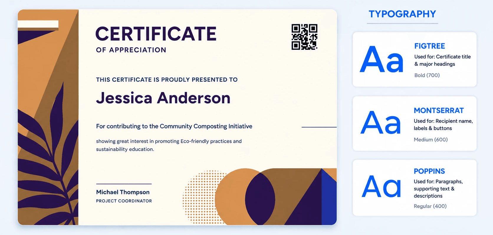
Not every certificate needs to feel like a courtroom document. Figtree has soft, rounded curves that bring genuine warmth without sacrificing clarity - great for community programs, workshop completions, or youth achievement certificates. Montserrat adds a modern sans-serif touch with a slightly playful undertone, thanks to clean geometric lines that still read as professional. Poppins leans further into friendly minimalism, giving training certificates and course completions a fresh, contemporary look that feels made for the digital age.
Also worth exploring in this category: Raleway, Space Grotesk.
06 - Precise and Purposeful: Lexend, Raleway, Didact Gothic
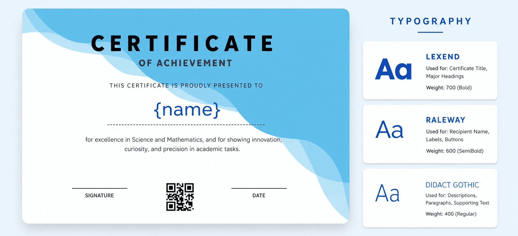
Some fonts exist specifically to solve the legibility and readability problem. Lexend was literally designed with reading proficiency research behind it - it's a smart default whenever clarity has to win over style. Raleway brings elegant letterforms and generous spacing for an upscale, contemporary feel that still prioritizes clean reading at all sizes. Didact Gothic takes a different angle - it's inspired by the way letters are taught to children, resulting in an exceptionally clean and neutral typeface that never gets in the way of the content.
Also worth exploring in this category: Philosopher, Noto Sans.
07 - Bold Statement Headers: Oswald, Space Grotesk, Philosopher
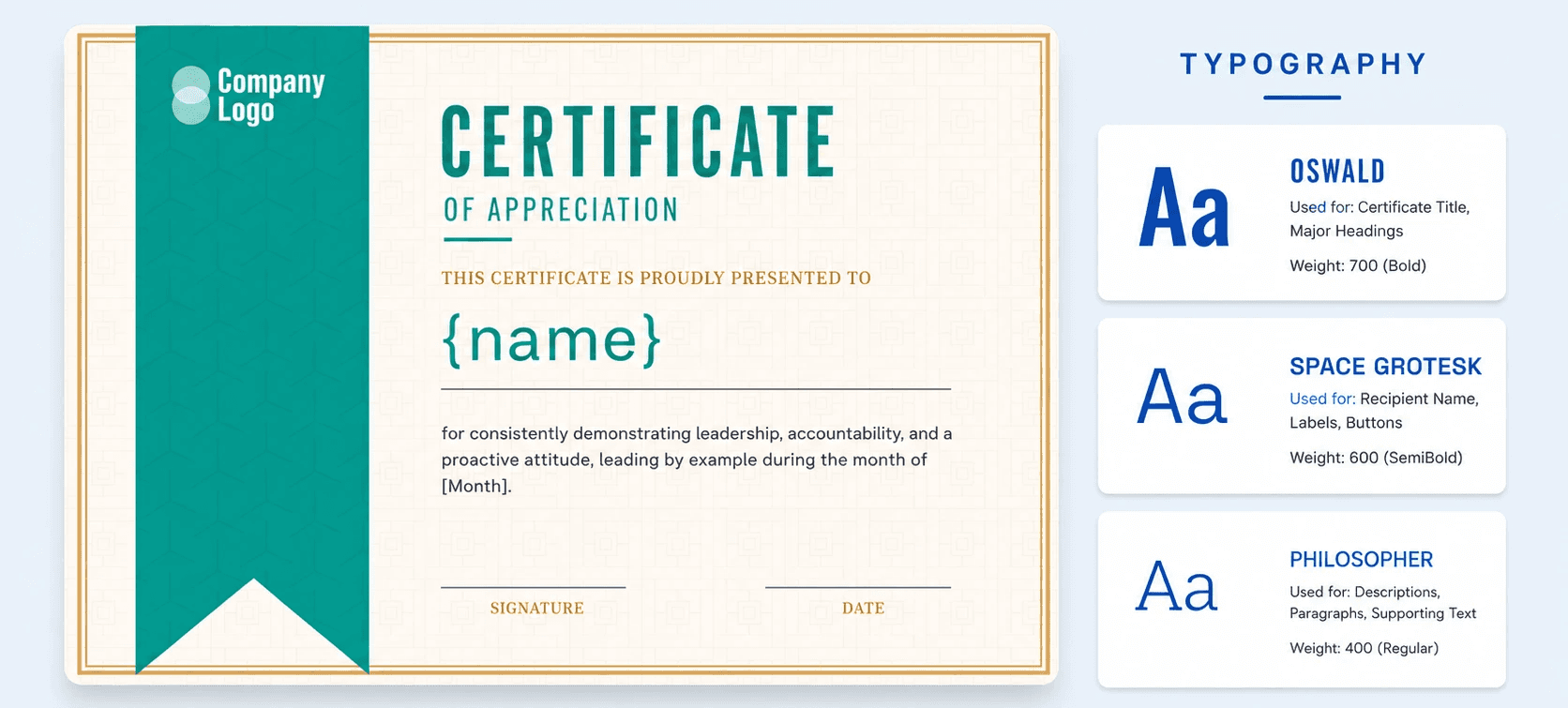
When you need a title that commands presence without consuming the whole page, Oswald is the tall, condensed answer - strong enough to anchor a design without overwhelming it. Space Grotesk brings a slightly technical, distinctive edge that works especially well for design, tech, or innovation-focused certifications. Philosopher bridges the gap between the two - it has the intellectual weight of a classical serif sensibility but delivered in a clean, structured form that reads as contemporary without trying too hard.
Also worth exploring in this category: Cinzel, Metamorphous.
08 - Flowing Elegant Scripts: Imperial Script, Great Vibes, Alex Brush
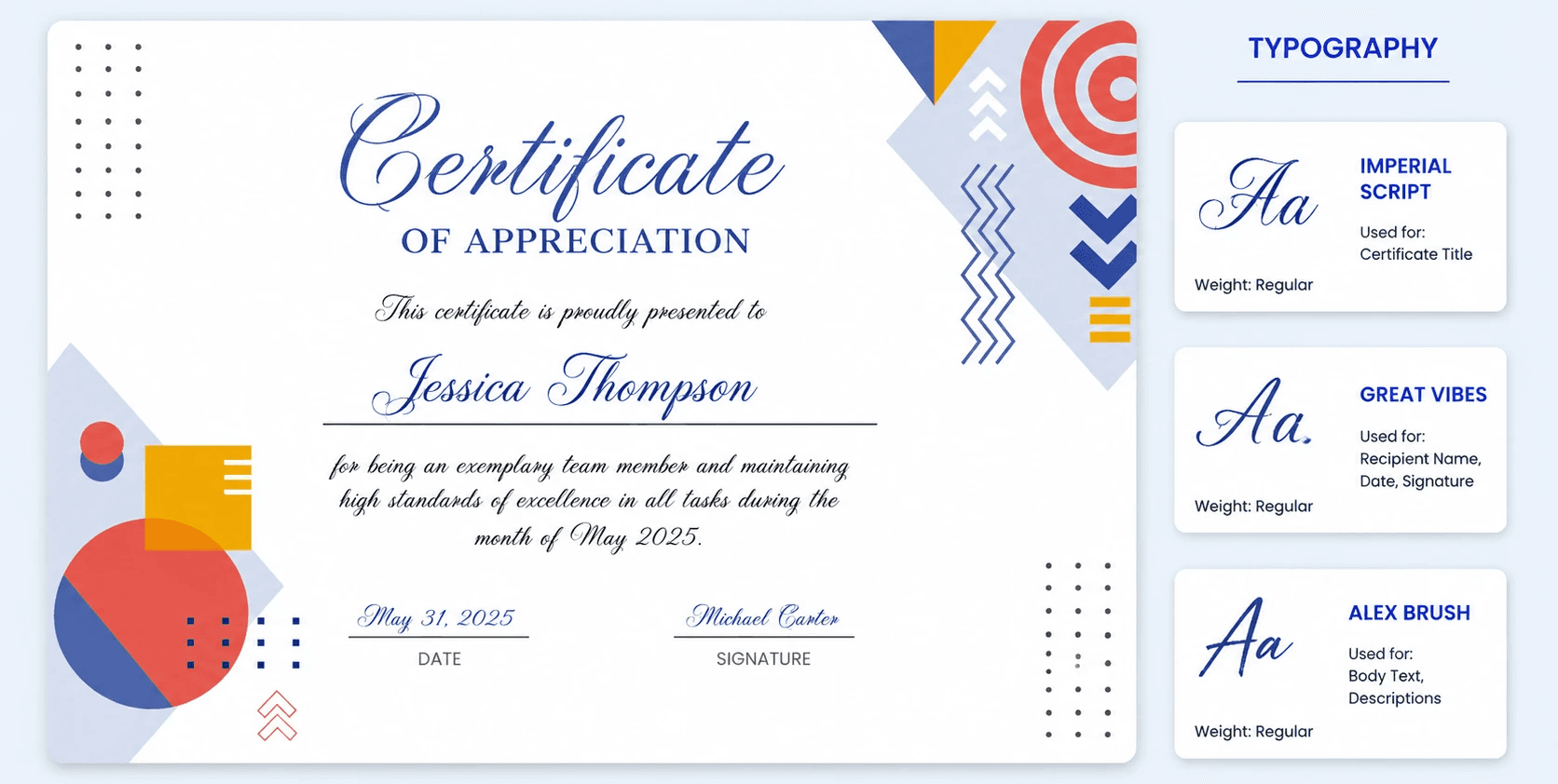
This is where cursive font choices earn their keep - almost always as an accent, never as body copy. Imperial Script brings real sophistication and ceremony, ideal for a signature line or a beautifully rendered recipient name on a formal award. Great Vibes has a confident, flowing elegance that sits perfectly at large sizes - it's the kind of script font that makes a certificate feel handcrafted and personal at the same time. Alex Brush is the most delicate of the three, with fine, graceful strokes that add a refined, understated flourish without overdoing the ornamentation.
Also worth exploring in this category: Allura, Tangerine, Pinyon Script, Herr Von Muellerhoff.
09 - Romantic and Vintage Scripts: Parisienne, Pinyon Script, Ruthie
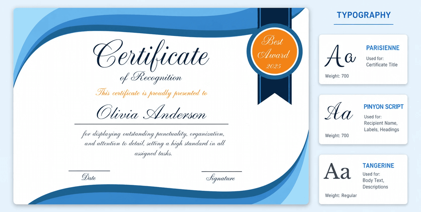
Parisienne has a graceful, almost Parisian vintage charm - the kind of decorative font that adds a genuine touch of elegance to creative or personal achievement certificates. Pinyon Script is even more delicate, with fine hairline strokes that feel genuinely calligraphic - it's an elegant script best reserved for short, impactful lines like a name or a title. Ruthie is the most personal of the three, with a casual, hand-lettered warmth that feels like a note written by someone who genuinely cares - great for informal awards or personal recognition certificates.
Also worth exploring in this category: Jim Nightshade, Allura, Tangerine, Gochi Hand.
10 - Historic and Ceremonial: Unifraktur Maguntia, UnifrakturCook, Cinzel Decorative
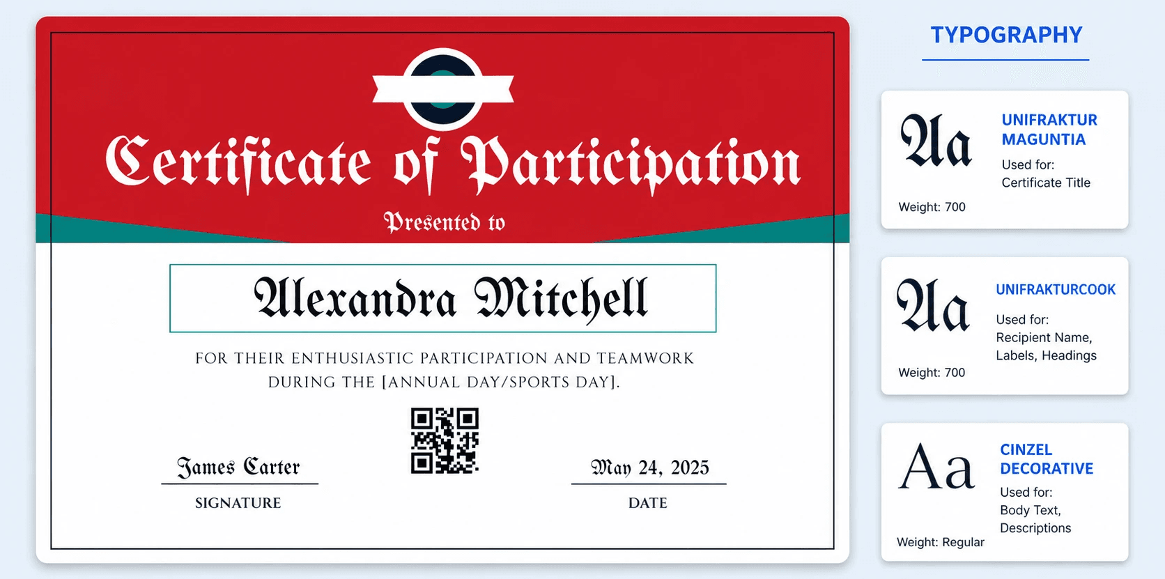
Reminiscent of an old English regular font, Unifraktur Maguntia is a blackletter-style typeface that carries serious historical weight - striking on heritage-themed or ceremonial certificates, title-only. UnifrakturCook is its slightly more readable blackletter sibling, with a touch more warmth in the letterforms while keeping the same historic gravitas. Cinzel Decorative takes a different route to ceremonial: instead of blackletter, it leans into Roman-era capitals with decorative flourishes - all the ceremony, significantly more legibility at small sizes.
Also worth exploring in this category: Uncial Antiqua, Metamorphous, Almendra Display.
What's the Best Font for a Certificate Name?
The recipient's name is the single most important line on the page, so the best font for certificate name treatment isn't really about which typeface - it's about hierarchy. A good rule of thumb:
Recipient's name: the largest element on the certificate. Using a larger font size here - somewhere in the 20 to 50 point range - draws the eye exactly where it should go first.
Certificate title: slightly smaller than the name, generally 14 to 30 points, so the visual order still reads name → achievement → details.
Body text and details: keep this tight, around 10 to 14 points, prioritizing clarity over flourish.
Signatures and dates: these can run smaller still, often 8 to 30 points depending on design - present, but not competing for attention.
For formal documents like diplomas, pairing a serif name (think EB Garamond or Libre Baskerville) with a script signature line (Imperial Script works beautifully here) creates a classic, ceremonial look. For something more modern and casual, a bold sans-serif name - Lexend or Montserrat both do the job - keeps things clean without losing presence.
Tips for Pairing and Adapting Certificate Fonts
Picking individual fonts is only half the job. Here's how to make them work together once you've made your shortlist.
Limit yourself to two or three typefaces. One for the title, one for the name, and - if you want it - a script accent for the signature. Stack more than that and the design starts to look chaotic instead of considered.
Create contrast on purpose. Pairing a serif with a sans-serif (or mixing weights within the same family) gives the design structure. Two similar serifs or two decorative fonts side by side tend to look accidental rather than intentional, so opt for a different font to create balance.
Match the font to the brand, not just the occasion. A modern training program probably calls for Inter or Figtree, not a heavy blackletter. A century-old institution issuing diplomas can lean into EB Garamond without it feeling out of place.
Test before you commit. Fonts that look gorgeous on screen sometimes lose legibility once printed, scanned, or compressed into a PDF. Mock up the real thing - recipient name, full title, signature line - before locking in your final font choice.
Serif or Sans-Serif: Quick Decision Table
Choose a Serif Font When... | Choose a Sans-Serif Font When... |
The certificate is academic, formal, or ceremonial | The certificate is modern, digital-first, or casual |
It's primarily going to be printed and framed | It's primarily going to be viewed on a screen |
You want a traditional, established feel | You want a clean, minimal, contemporary feel |
Try: EB Garamond, Libre Baskerville, Noto Serif, Playfair | Try: Roboto, Figtree, Montserrat, Lexend, Inter |
Final Thoughts on Choosing the Right Certificate Font
There's no single perfect certificate font that wins every time - the right pick always comes down to formality, audience, and where the certificate will actually be seen. What matters is that you treat font choice as seriously as the wording itself, because a typeface that's hard to read or feels mismatched can undercut even the most meaningful achievement.
Whether you land on the literary charm of EB Garamond, the screen-friendly precision of Inter, or the ceremonial flourish of Imperial Script, the goal stays the same: a certificate that's easy to read, feels right for the occasion, and makes the recipient want to keep it somewhere visible. With Wauld, you can bring these typography choices into your certificate design and create professional, polished credentials that match the achievement they're meant to recognize.
FAQs on Best Fonts for Certificates
Still have questions about certificate fonts? Here are quick answers on font choice, sizing, pairing, and what to avoid.


